Paper Plans: an online information archive
Worked as a part of a team of designers to create a navigation system for an online information archive on the topic of air travel
What is Paper Plans?
Paper Plans was the outcome of a 6-week collaborative project, where I worked with Applied Works, a London-based design agency that combines data, editorial and user-centred design to help organisations present and discuss complex themes with different audiences around the world.
We worked with them on a brief challenging us to design a way for people to experience the Hoffmann Centres' collection on Air Travel. Our goal was to design a compelling experience that facilitates exploration in a dynamic, compelling and human way for new, post-factual audiences.
research
De-coding the brief
information architecture
We delved into complex information architecture, developed this into a website and complimented this with interactive Augmented Reality design.
We divided the initial research into parts, during the first of which we worked collaboratively in Miro to create several mindmaps, and begun on developing Case Studies.
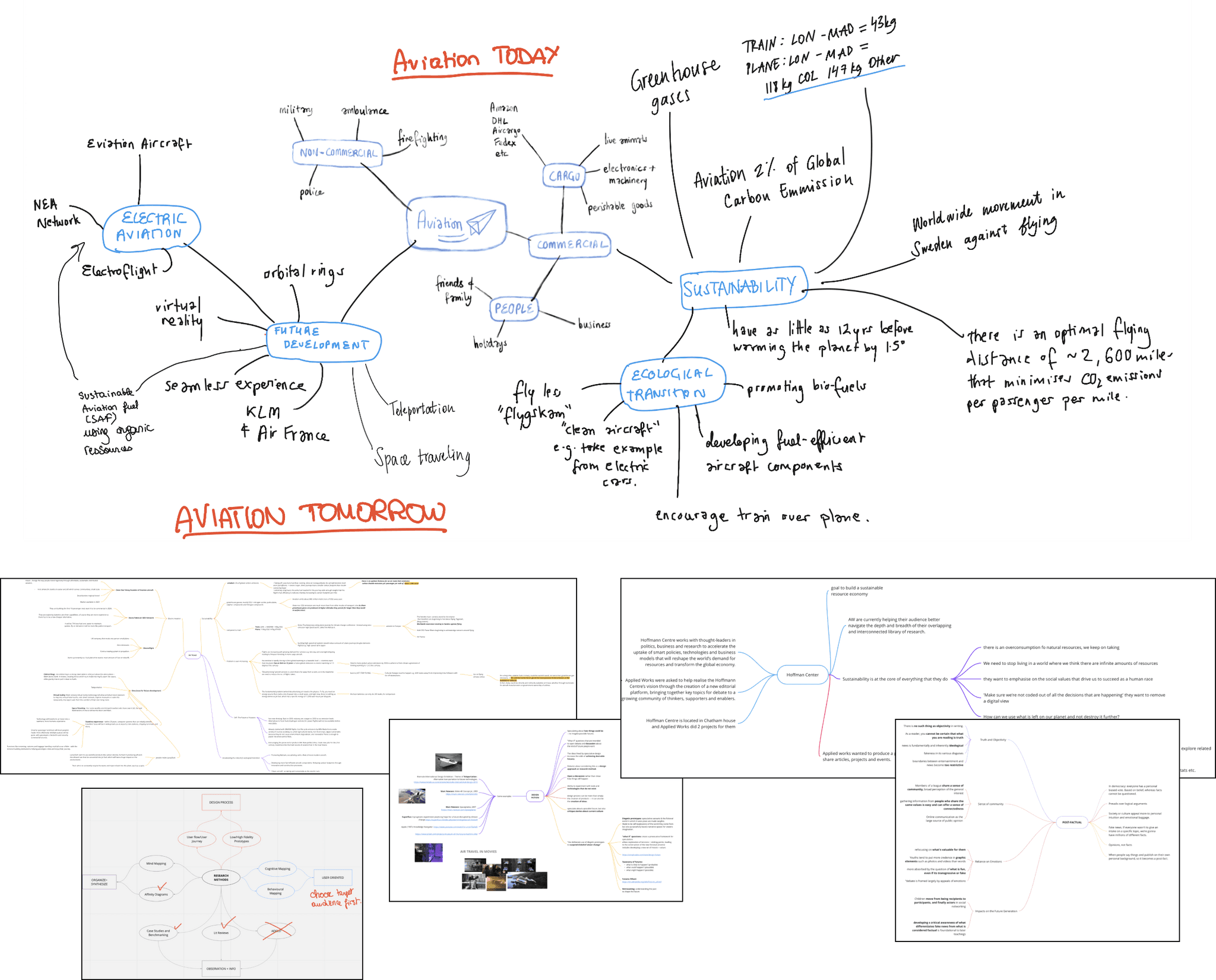
Miro mindmaps on Air Travel, the Hoffmann Centre, Design Fiction, Post-Factual Audiences and Research Methods made by the whole team.
storyboarding
As well as deciding our target age group (16-18), we begun applying our case studies and each doing some storyboarding to explore potential ideas. This lead us to a map layout of information, which would allow the user to visually map topics together, having the ability for the map to expand the map as more themes and tags were added.
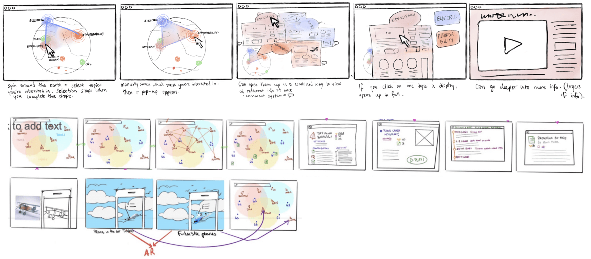
Both mine (first) and another group members (second) storyboards.
speed dating
Round one
We developed an AR idea from previous iterations into a scrollable globe, alongside a web-based map and game concept, speed dating it with people in our target age range.
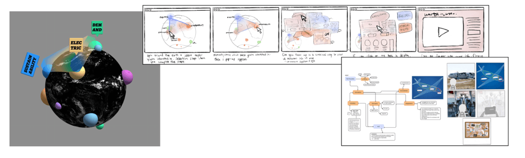
Both mine (first) and another group members (second) storyboards.
Round two
We took the feedback from the first round and applied it to the second, creating a more finalised version of the AR, as well as two examples of how navigation in the AR might work.
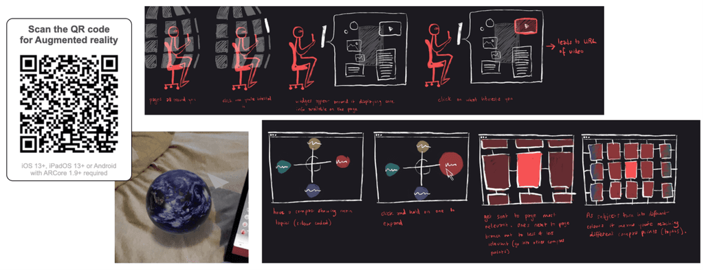
I made a working QR code for the Globe seen above (try it out!), as well as two revised versions of the AR information layouts, based on the feedback we received from the first round.
research
Planning the user journey
We worked together to develop a user journey based on what we learnt from speed dating with our target audience.
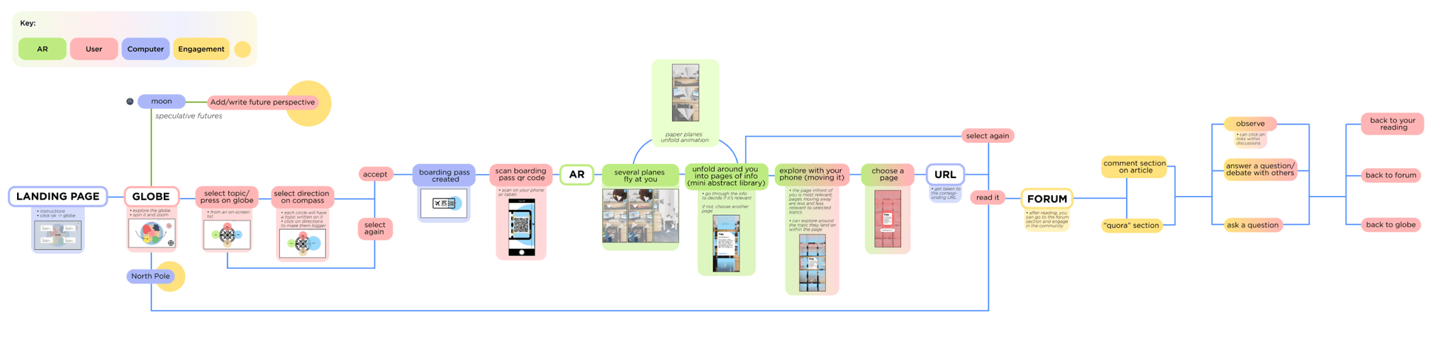
Our user flow and low-fidelity wireframes.
augmented reality
Crafting the AR
We needed to think about information hierarchy and connect directional metaphors (planes and globes) with navigation in the experience.
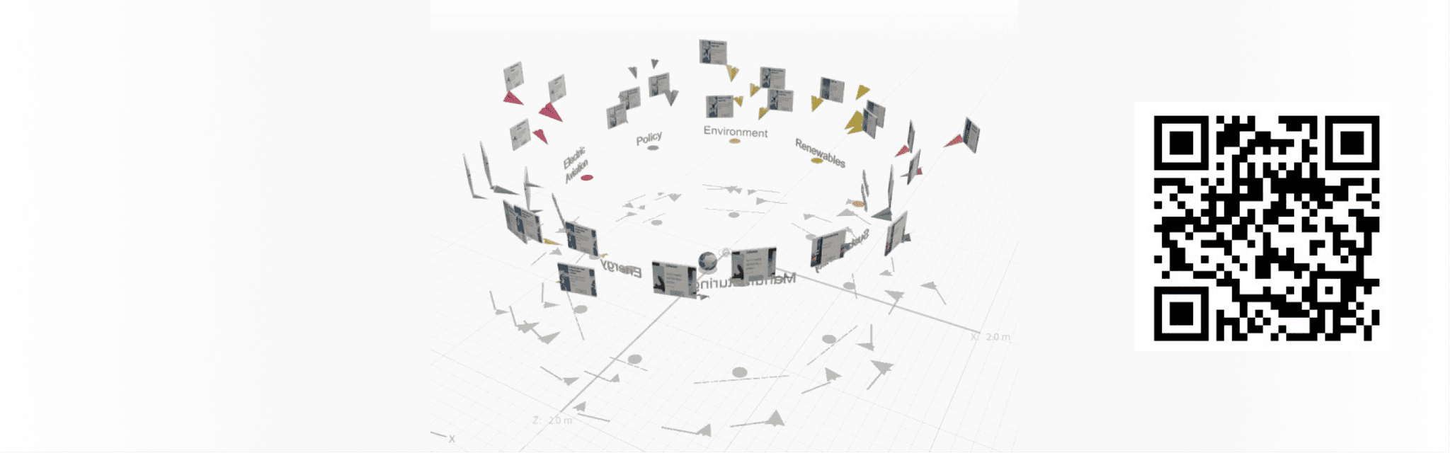
The final structure of the AR. If you have Adobe Aero installed, please try out the QR code!
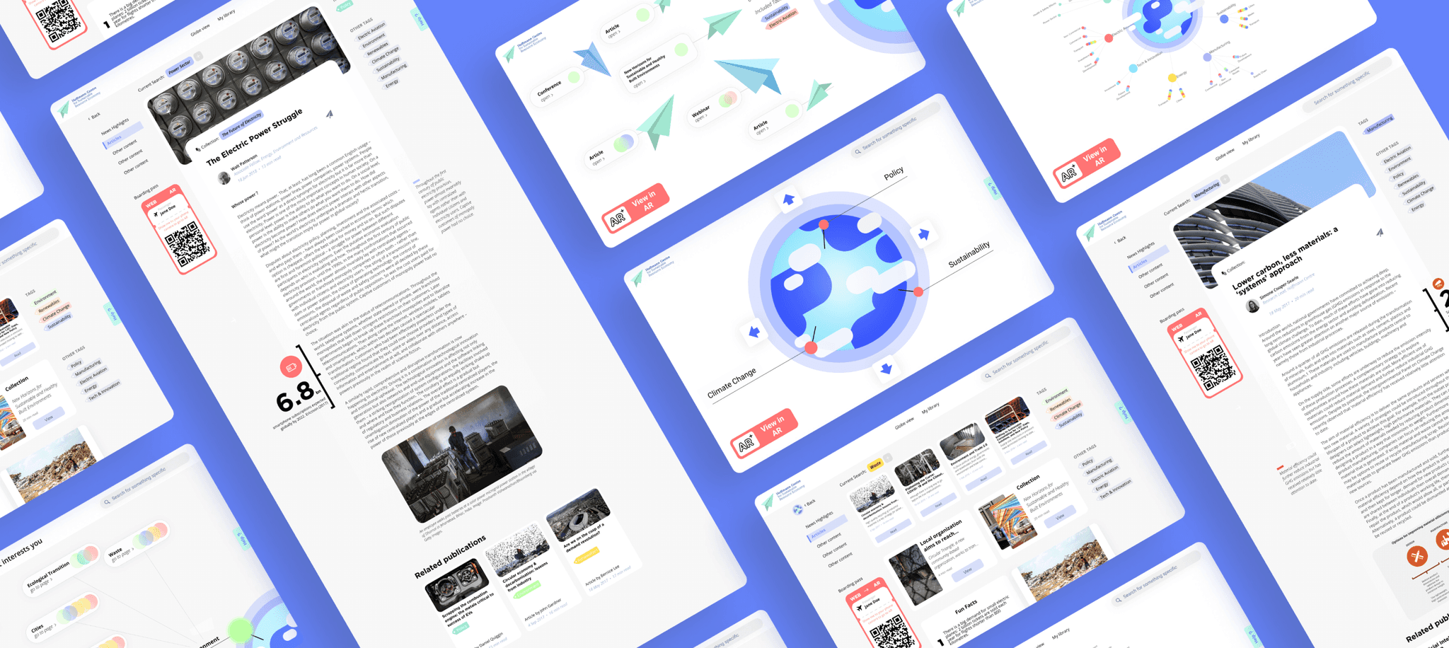
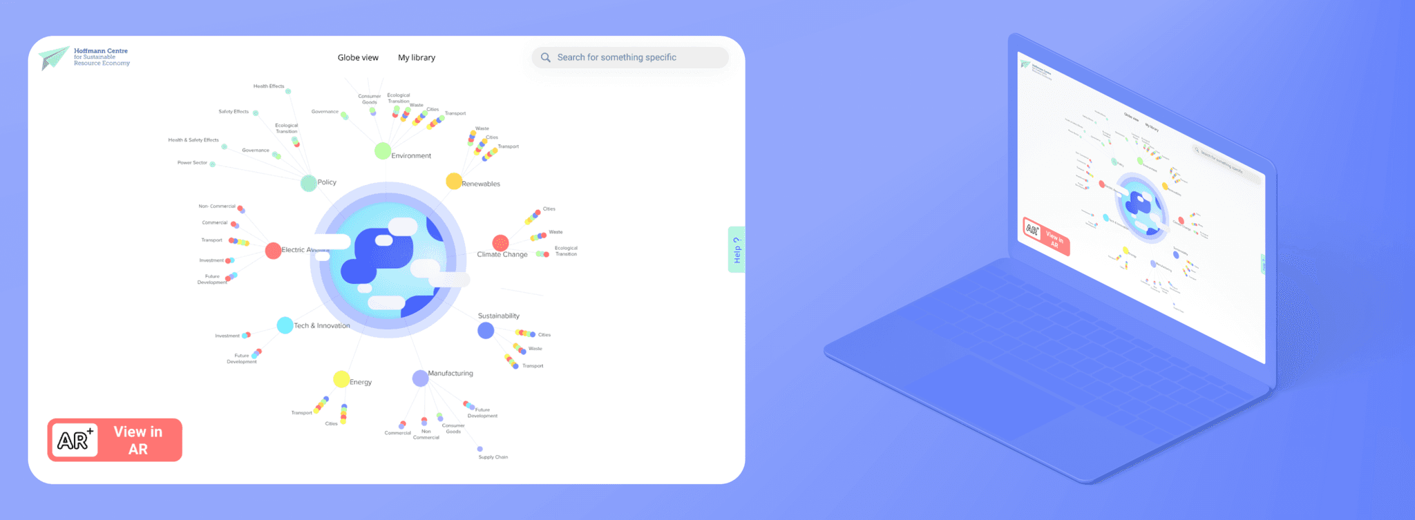
The final design
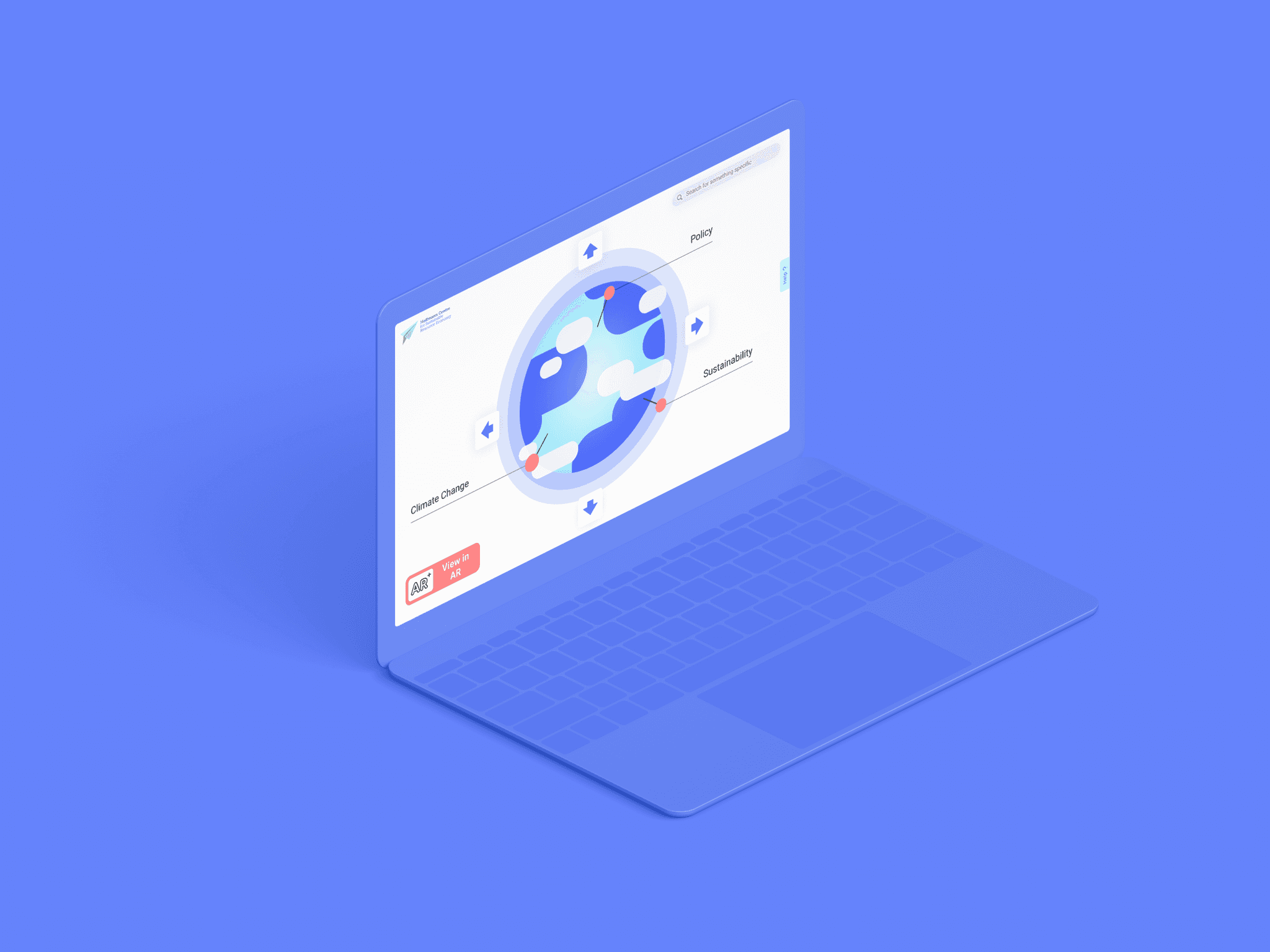
We wanted to highlight the globe and paper plane metaphors in the site to emphasise the themes of navigation visually. They are a big part of the imagery, with the rest of the UI being clean and simple.
Below, you can find the personal library feature which was a main part of the project, and was where you find your own curated collection of articles and media that you can save by clicking on a paper place icon. These articles then show up as coloured dots in the library, where you can zoom in for more detail. We thought this was the clearest way of displaying a large amount of information all at once, so we made it its own page — something the user could return to after browsing.
challenges & final thoughts
On reflection…
This project was unusual because we did it during the worst of the pandemic, and also the worst of lockdown. We did not have any meetings in person, and got to know Zoom very well. Considering this, both my team and Applied Works were very happy with the outcome we came up with. They mentioned they would have loved to give the project even more time because there are so many more things they would love to see implemented.
View next project