Unveiling Dark Mode
Creating dark mode for DataCamp from scratch
I noticed we were getting a huge amount of NPS feedback from our users about how they love the DataCamp product, but would like to see us introduce dark mode. I took this to the team and lead the effort in introducing this to the product.
Where we started
We wanted to introduce dark mode to DataCamp as the majority of our users are learners, so we wanted to optimise our website to accommodate learning at all hours of the day without straining the eyes.
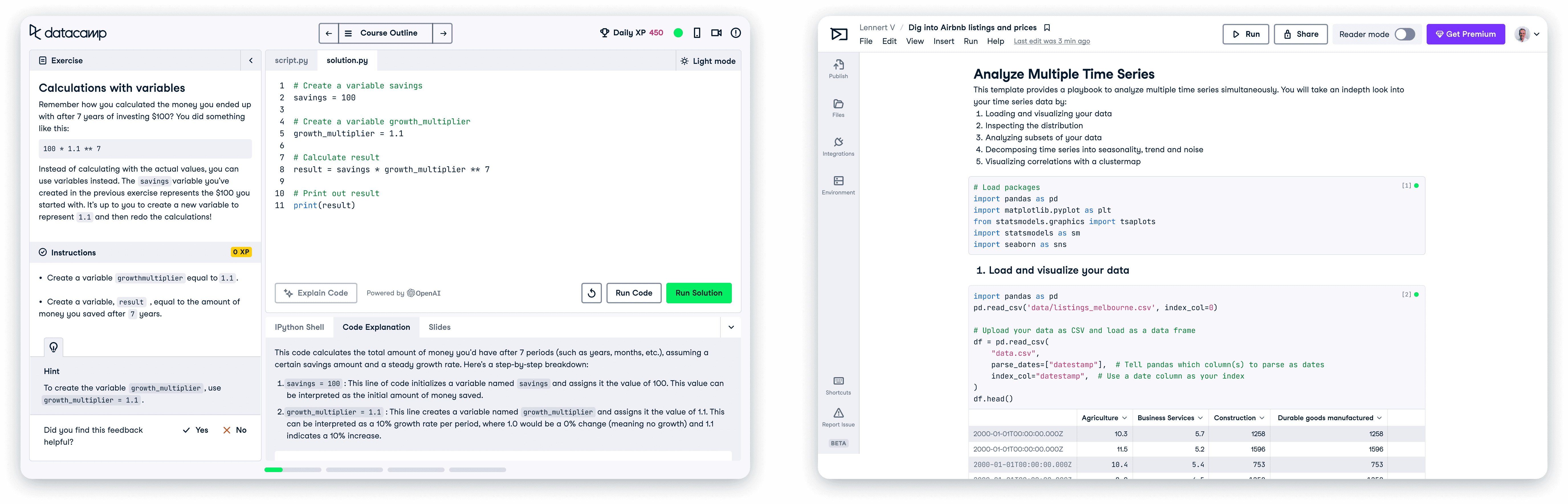
Our website was entirely built in light mode, being a mix of white, light grey or beige.
Research
Which direction do we head in?
I took a look at several competitors I thought had an effective dark mode. I wanted to find examples of websites and design systems that handled dark mode well, so that I could consider them going forward. I ended up really liking how Github & Atlassian handled this.
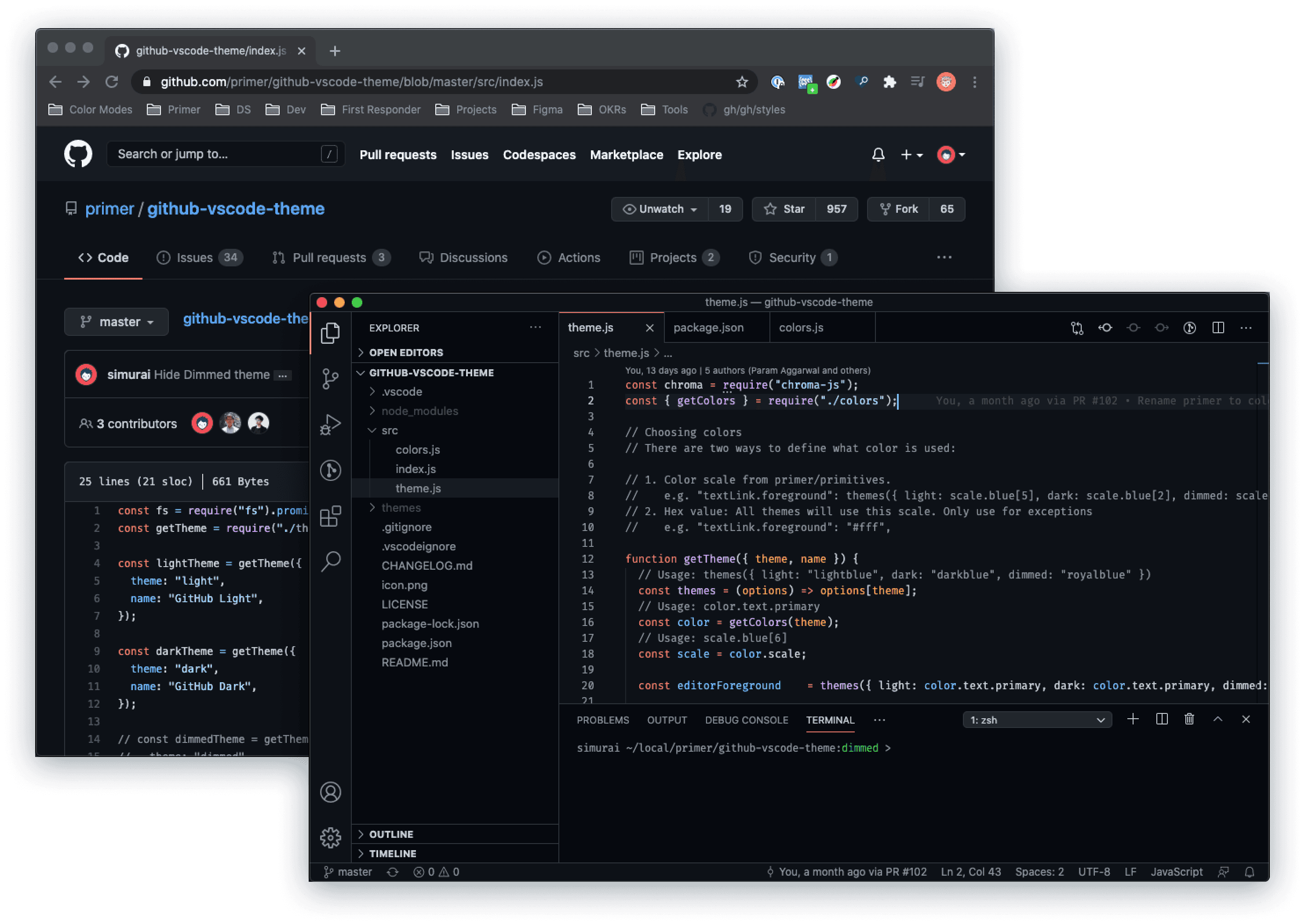
I really liked GitHub and Atlassian. Their websites and design systems were almost perfect examples of what I envisioned DataCamp having.
experimenting
Playing with how it could look
I spent some time figuring out how dark mode could look. I needed to make sure content hierarchy stayed the same between modes, as well as keeping a visual balance. I also needed to consider how bright I wanted text to look on screens, wanting to avoid using pure white as our main text colour.
My initial experimentation with how dark mode would look.
colour
Picking an approach to colours
I needed to think of a way we could structure our existing colours so they'd work in dark mode. Since we already had a defined and extensive colour palette for our brand, it was important I found a way to utilise what we had, instead of jumping straight in to creating new sets of colours.
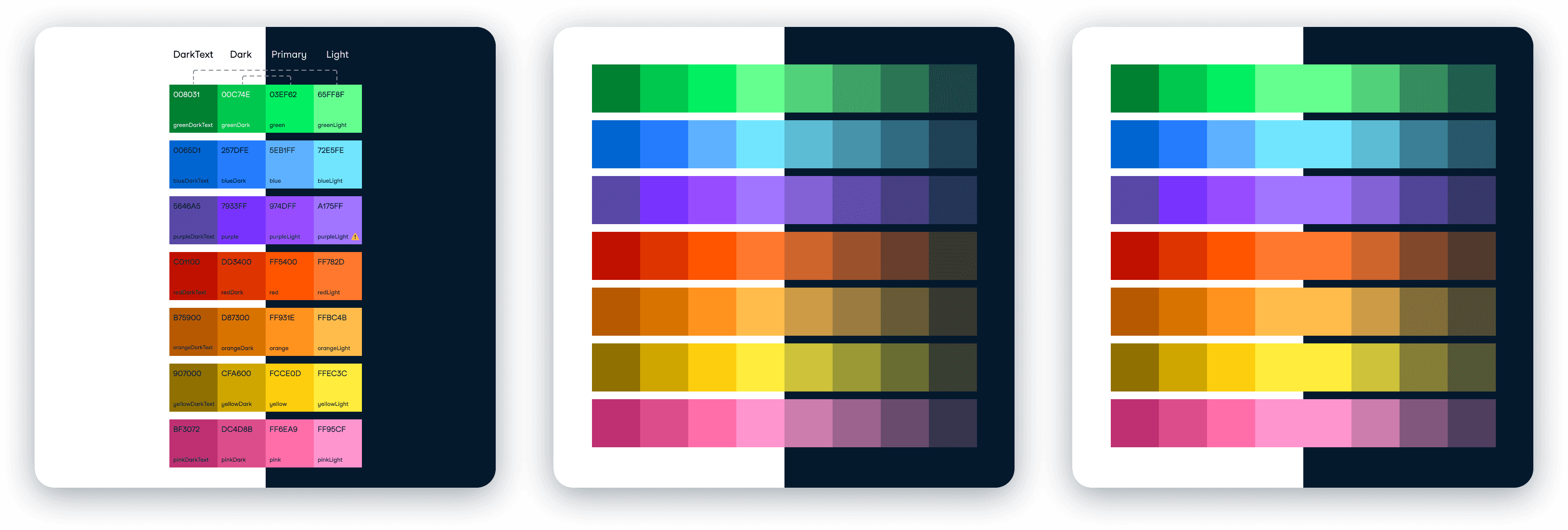
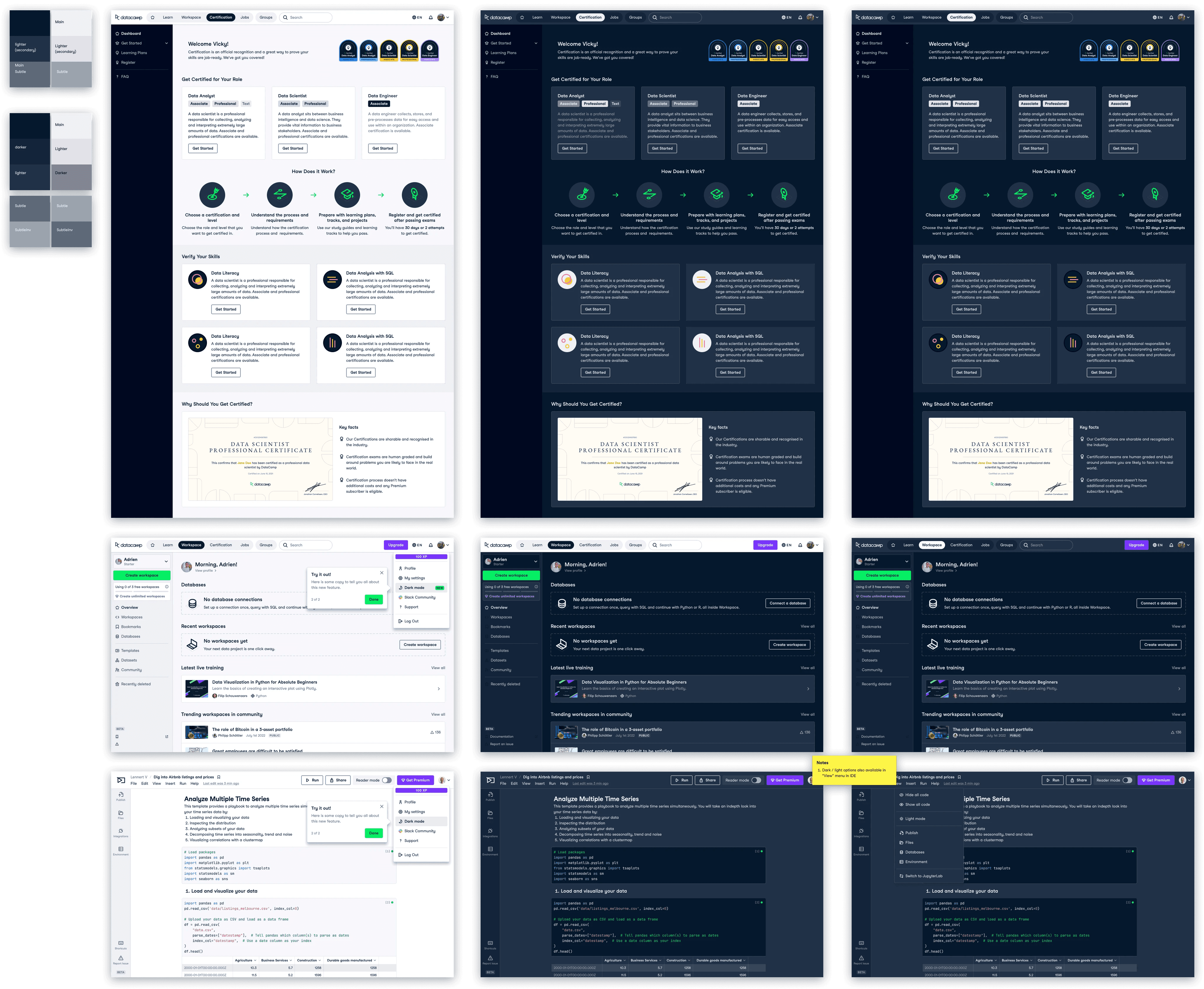
image 1
This depicts a symmetrical approach, where our existing swatches are divided in half, each half becoming a mirror. The colours on the left on the lighter background (light mode) were our darkest colours, and the right (dark mode) were our brightest.
image 2 & 3
In this approach we would retain our entire set of colours for use in light mode, and create a new set of desaturated colours for dark mode. This was the approach MUI (Material UI) took, and it made sense as the desaturated colours are easy on the eyes. The only difference between no.2 & 3 is that in no.3 I kept the middle colour in both light & dark modes.
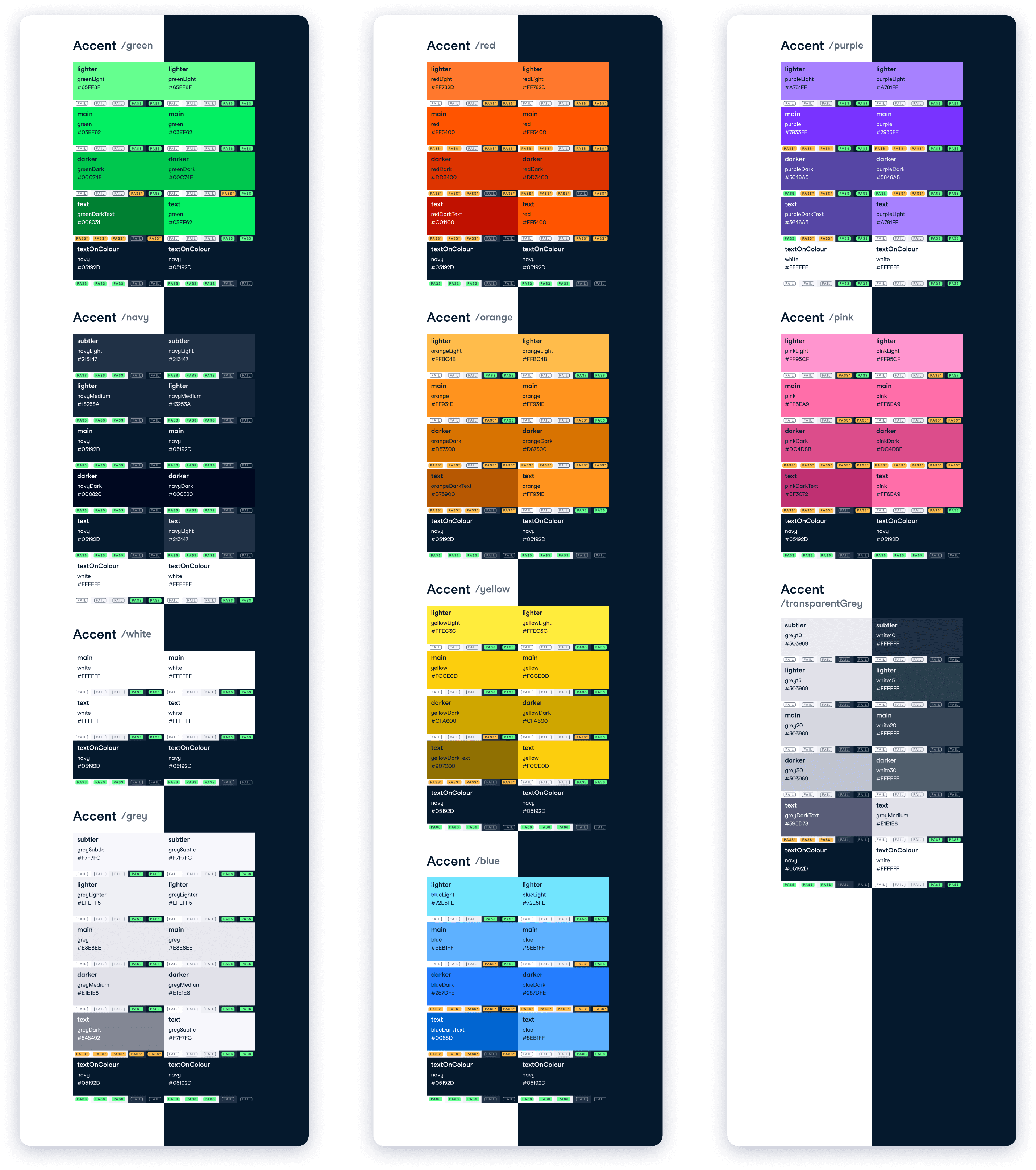
The chosen approach
We ended up settling on a mix of all three of the above. I wanted to go with a method that didn't need us to introduce new colours, and thought we could achieve the look we wanted this way. The below approach depicts our colours (we typically have four colour shades for each main accent colour) mapped 1:1 light to dark, with the exception of our colour text accents, which had to map differently for accessibility.
Design proposal
After I had ideated enough on my own, it was time to propose my ideas to the design team. I received a lot of valuable feedback, most of which was regarding the background colours, and how they would be organised so that the needs of all our products would be met. This was a challenge, as since we had not been designing with any rules for colour application, imposing a structure now would be quite challenging.
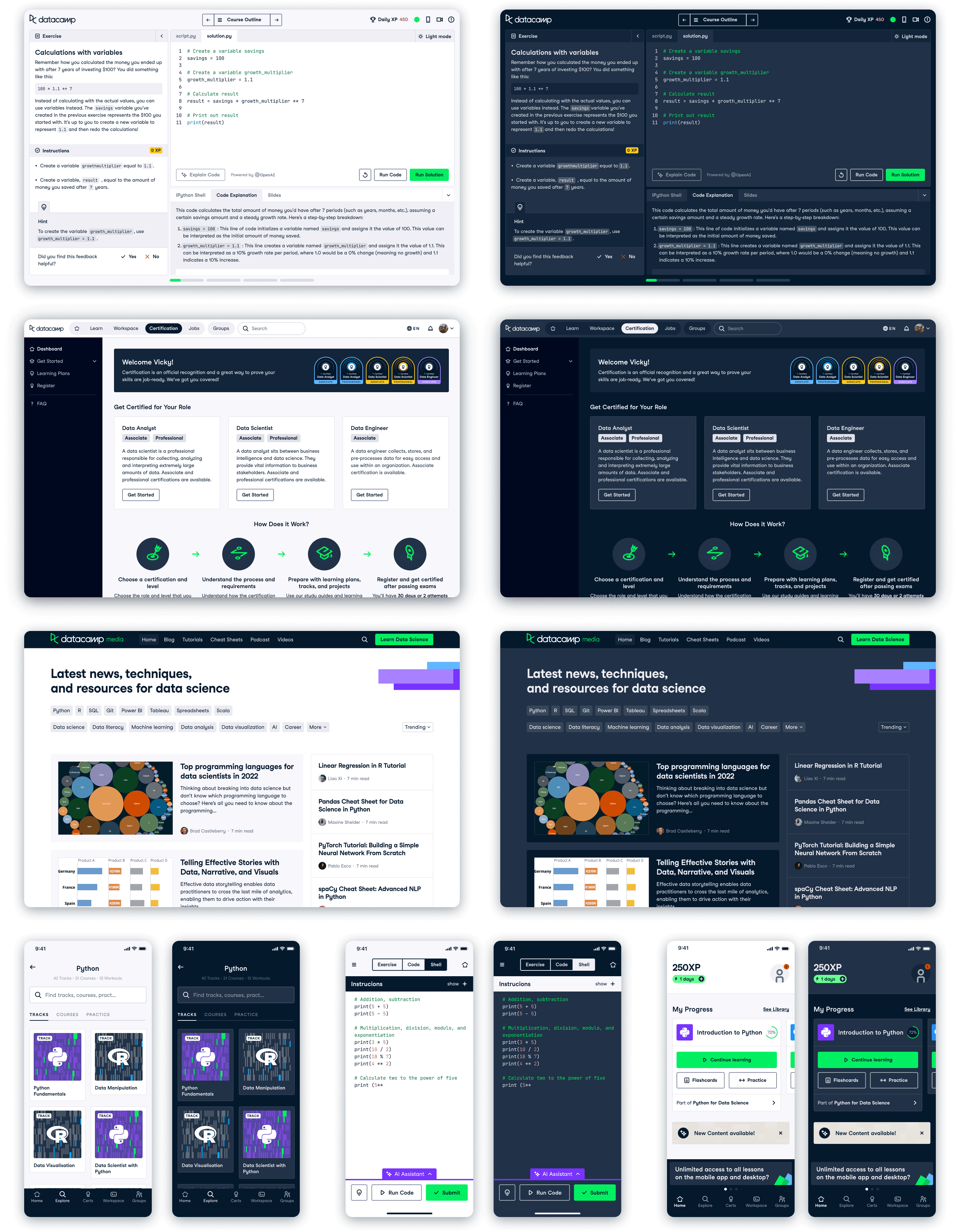
We do not use the same background colour across the product, so we needed to consider how this would be handled.
How would users access this?
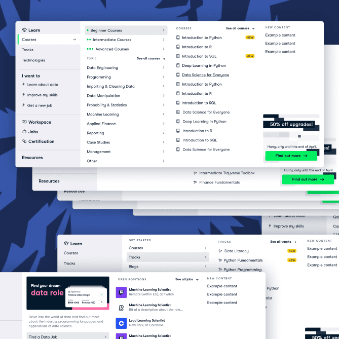
I also needed to consider how this would be activated in-product. After speaking with product owners across DataCamp, we agreed it would be best placed in the top navigation drop down menu as this is a common UX pattern, and it would work across the whole site.
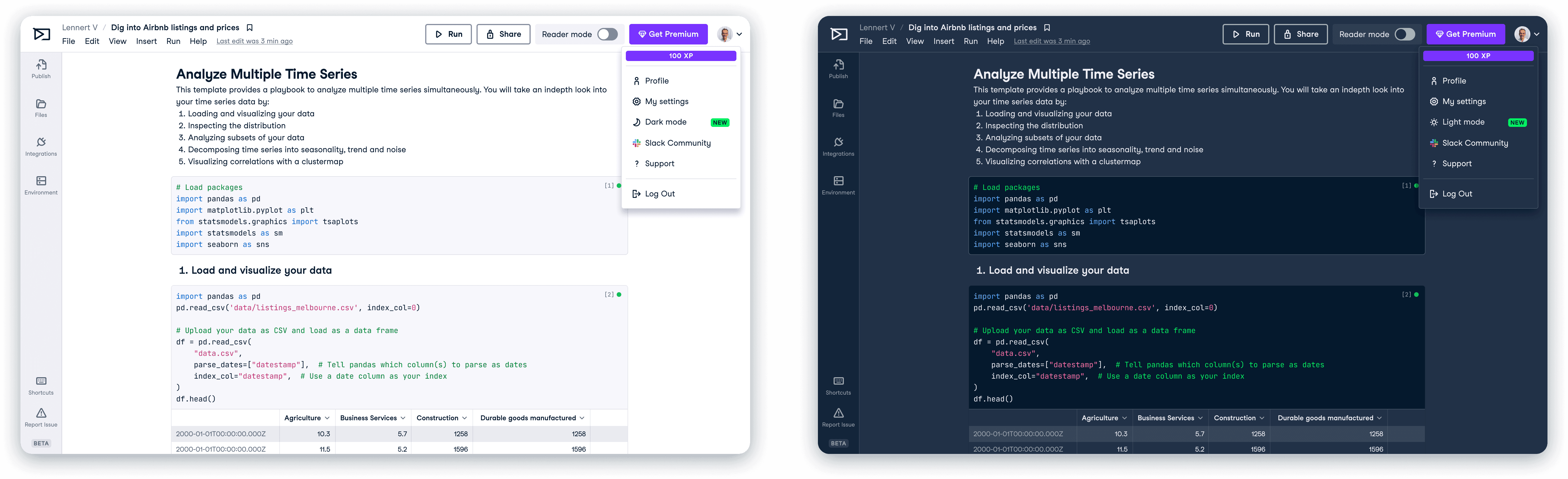
In the top-right of the above images, you can find the dark / light mode theme options we proposed.
Tokens and semantic naming
With theming came a set of problems and terminology that were new to me. One of which was Semantic naming - a type of naming that involves giving meaningful and descriptive names to design elements based on their function or purpose. I worked alongside our design system engineer to organise our tokens into groups, renaming them to have semantic names. This was a long process that involved a lot of thought as we wanted to end up with a solid structure for our tokens.
Colours were split up into three sections: function / sub-function / variant
Functions
Text, Background, Border, Accent, Status and Brand.
These groups describe the function of the colour you will use e.g. where will this be on the page? Is it decoration, or does it have meaning? Will it be used as a background, or as an accent colour?
Sub-functions
Interaction, Green, Navy, White, Grey, Red, Orange, Yellow, Blue, Purple, Pink, TransparentGrey, Success, Error, Warning, Info, and Upgrade.
Once you have decided where you are applying the colour, you can pick a sub-function e.g. I want to use a status colour, and I want it to show a Success state, so I will use status/success.
Variants
Main, Primary, Secondary, Tertiary, Lighter, Darker etc.
These are the final level of specificity, and dictate how dark / subtle a colour is according to how it will be consumed e.g. If you're writing the main text on a page, you use text/main. Similarly, if you want a light green accent, you would use accent/green/lighter.
Publishing & educating
After all the hard work had been signed off, then came the scary moment of having to publish all my hard work to the designers on Figma. I ran education sessions with the designers to introduce them to the concept of semantic naming, trying to break it down as best as I could. I also ran demo sessions where I would talk through how to implement theming step-by-step.
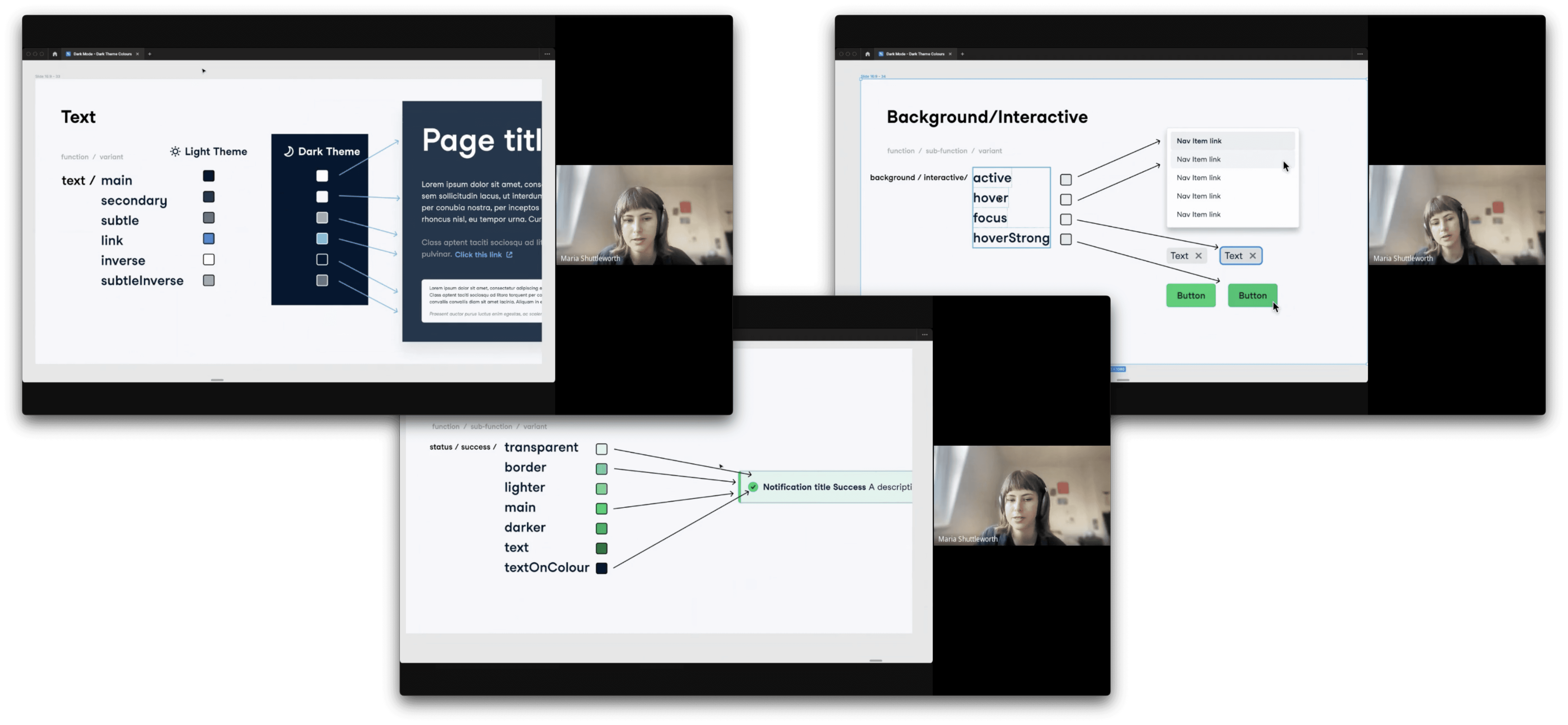
Screenshots of a dark mode demo session I ran with the design team.
View next project