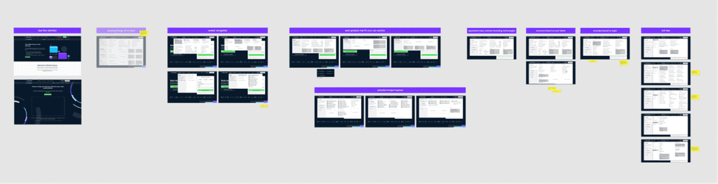
DataCamp navigation
Improving DataCamps navigation system
I helped re-structure parts of DataCamp's website navigation system. This resulted in organic registrations increasing by 40%, and a 15% total increase in organic traffic to core pages.
Who are DataCamp?
DataCamp is a learning platform aimed at democratising data science and AI education through interactive courses and hands-on projects.
I noticed that the website lacked a clear overall vision, resulting in inconsistencies in design and navigation across their products. The team saw this as an opportunity to enhance the user experience by restructuring the main menu, redesigning the most popular course pages, and implementing a consistent design system.
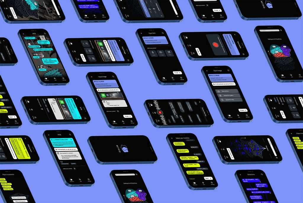
project 1
The megamenu
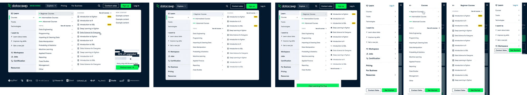
We started by re-designing the website's main method of navigation: the main menu. The first problem was that DataCamp had recently released new products and there was no room to display this on the current design. Secondly, and more importantly, although the menu is a primary form of site navigation, user data still showed low traffic to deep pages on the site. This meant there was a problem with how the menu had been designed; it wasn't surfacing pages relevant to the user, and thus not presenting our offering.
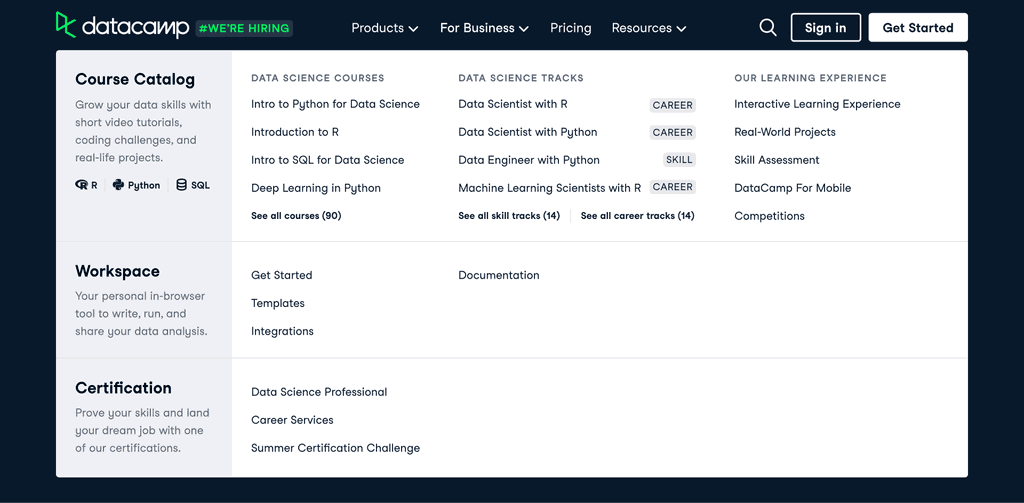
The menu design we started with.
Researching the problem
Competitor research
The first step in creating a user-centric design is to understand who your users are. We began with a market deep dive to discover more about how our competitors have approached this problem. We found that the majority of them tackled it by having an expandable menu, and one that is structured by user needs.
interviews & personas
It was very important that prior to designing we investigate what those needs are. At this point we did not have any comprehensive research done on who our users are, so we delved into interviewing so that we could build up some personas. We ended up with 5 personas, each reflecting the pain points, motivations and habits of these types of user.
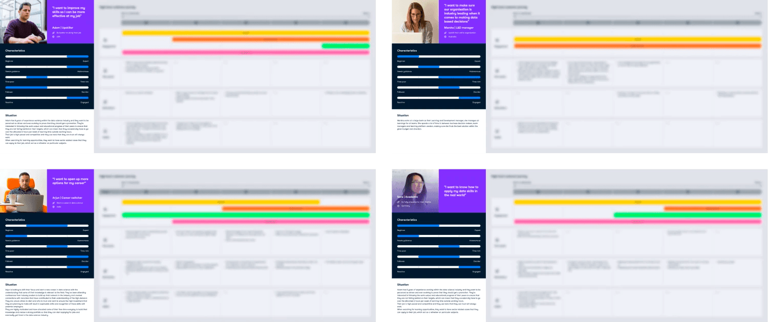
Our collection of personas.
experimenting
Design exploration
First round of ideation.
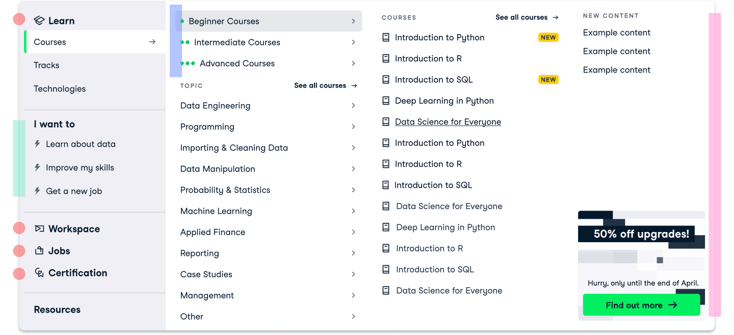
Based on our competitor research and personas, we started brainstorming. I created several wireframes and prototypes detailing the desired structure and type of content, while keeping in mind how the menu would respond to different sized screens. This was passed onto our stakeholders and iterated upon, until we found ourselves with a final approved design.
The approved design at different screen sizes
The final design
Whereas we previously didn't use a tabbed approach, this now means we have more space to display our entire range of products, and allow visitors to hover over the tabs to see more at will
We created a new “I want to” menu section based on our personas to allow users to search via their goals
Added a new beginner–advanced section to help separate information and reduce cognitive load. This also presents a different way to find content that might be easier for some users
Created space in the final column for highlighted content or current promotions
Measuring results
This new design was A/B tested for a duration of three weeks. During this time, we were able to see an increase in visits to core DataCamp pages by 31%, with over 40% more organic registrations and subscriptions. We were also able to make more room for additional products and resources, with space for future additions.
Increase visits to core DataCamp pages by
+31%
After only 3 weeks
Organic registrations & subscriptions increased by
+40%
After only 3 weeks
This was exactly the outcome we were looking for, meaning the new designs were here to stay. However, our journey doesn't end here. Although the navigation system was improved, there were still problems on pages the menu navigated users to. An example of which will follow.
project 2
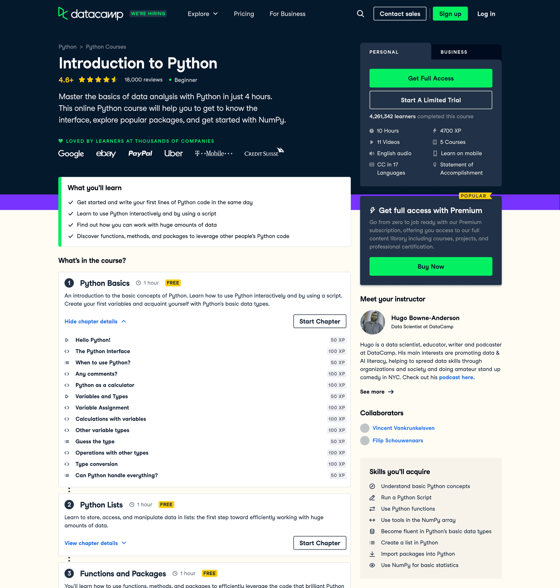
Course description pages
The course pages are some of the most important pages on the site — courses themselves are the reason the majority of users come to DataCamp in the first place. My work with the megamenu helped surface more of them, but there was still a problem; the course pages themselves had quite a bit of drop-off as you scroll down the page, and was missing a lot of key content that could help the user decide to register.
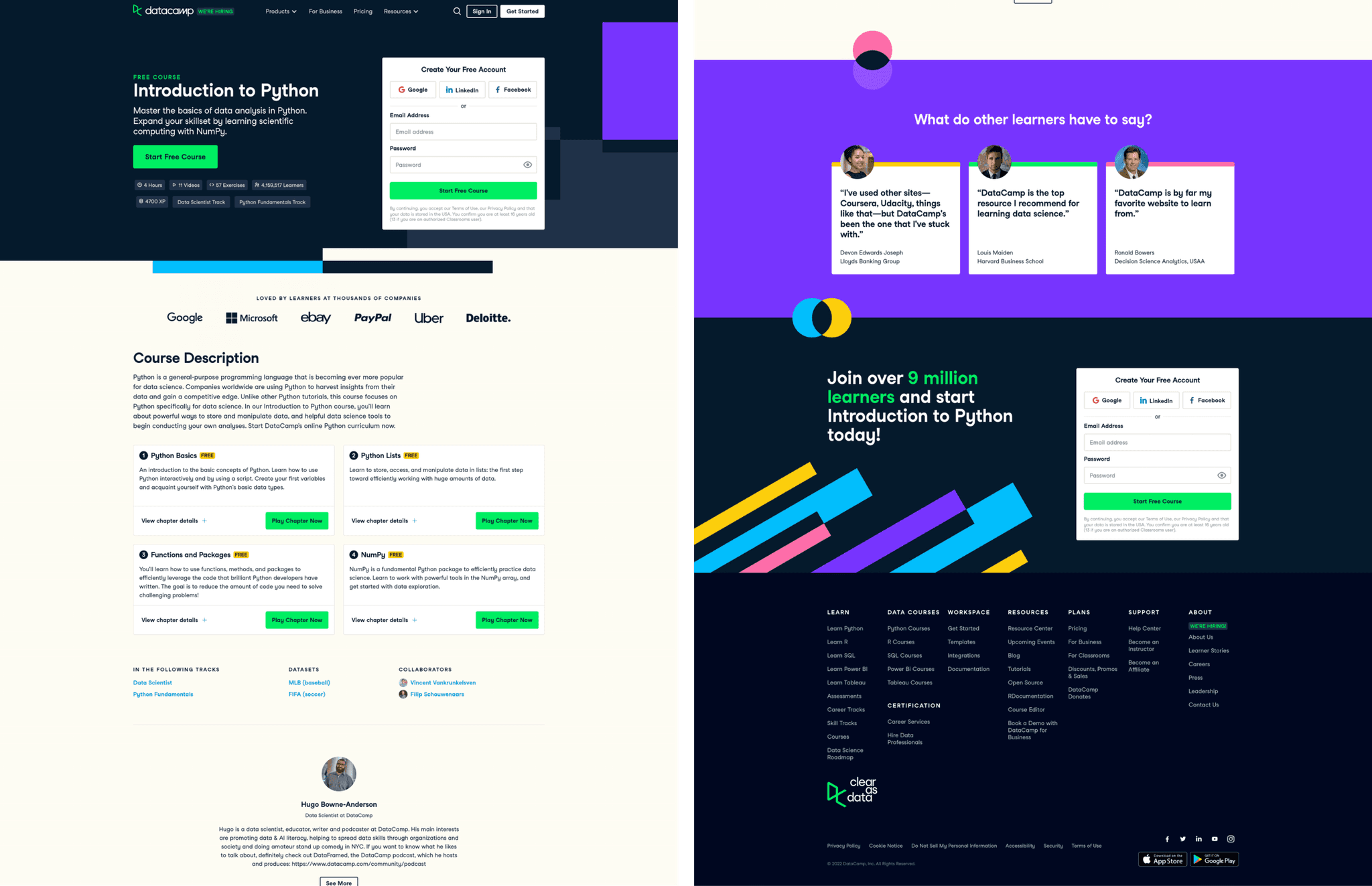
The page before the re-design.
Researching the problem
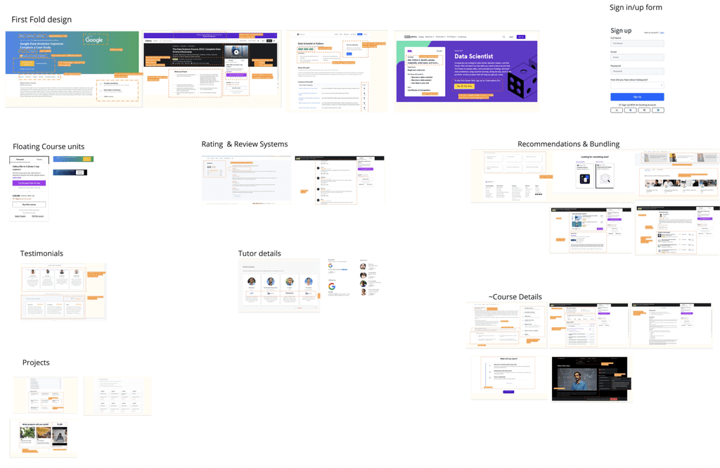
A collection of our competitor research.
Competitor research
We understood that our pages were lacking a lot of common practices:
Page scan-ability: We wanted users to be able to decide within seconds if their needs will be met with a small, concise section on what the user will learn.
Related courses: Aiding site navigation by providing an onward journey if this course wasn’t what the user was looking for & better internal linking structure between our courses.
Reviews & FAQs
Skill levels: A system to indicate what level the course is e.g. beginner, advanced — particularly important where we have several courses that look like duplicates but actually cover the same content for different experience levels/audiences.
workshopping
After concluding where we were lacking in our competitor research, we held a workshop with the key stakeholders to discuss, gather our must-haves and nice-to-haves, and discuss prioritisation.
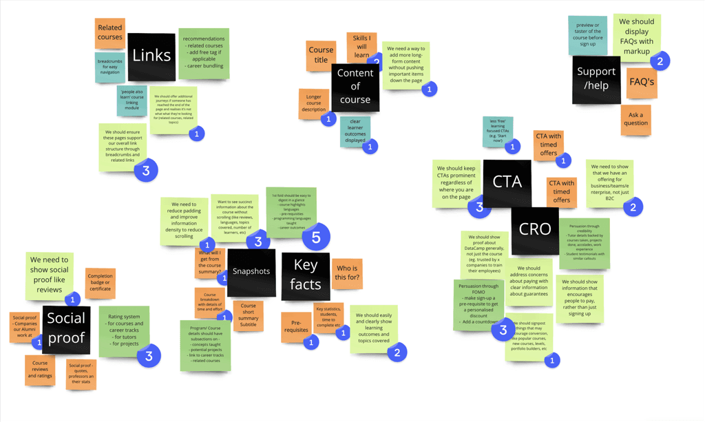
Sticky notes from our workshop
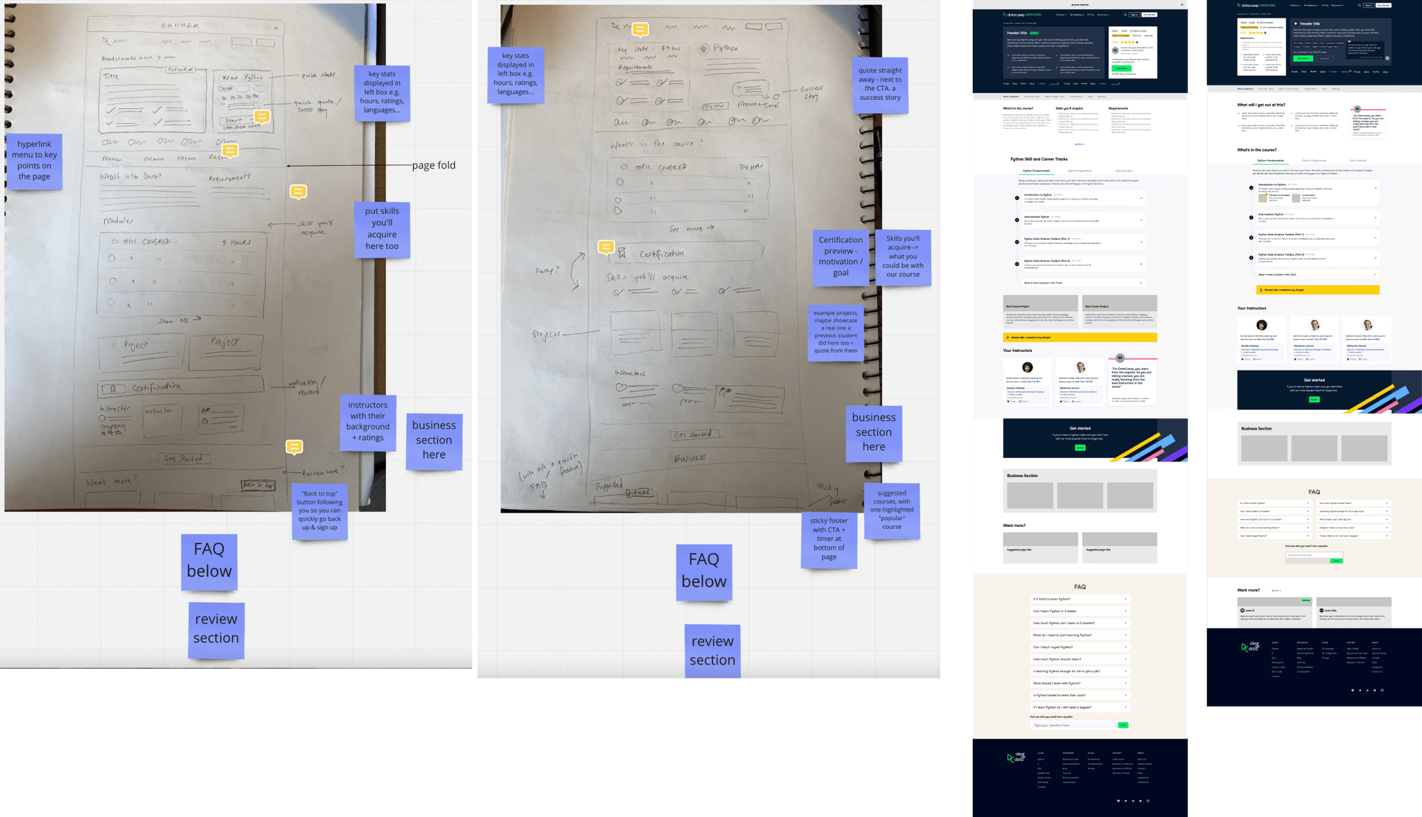
Sketches (left) & wireframes (right)
wireframing
Armed with these points, I started sketching. I then moved on to I creating wireframes based on the sketches to get a better idea of the page structure.
The final designs
Our re-design made the page a lot more information dense. We added breadcrumbs to the landing page to help the user understand where they were, as well as beginner / intermediate / advanced tags to alert them if this page was suited to them. We also surfaced a section on "What you'll learn" as this is another important piece of information in deciding whether to stay or leave.
We also broke down each course chapter in more detail to give the user a sense of the breadth of our content, which was previously lacking.
Further down the page, we made sure to include an "other courses you might like" section, as not only was this very common practice, but will help massively in navigating the site. Previously this page was previously a dead end, which would have seriously hurt user exploration.
We also incorporated a customer review section, where we highlighted quotes from our users about the course, and displayed a number rating.
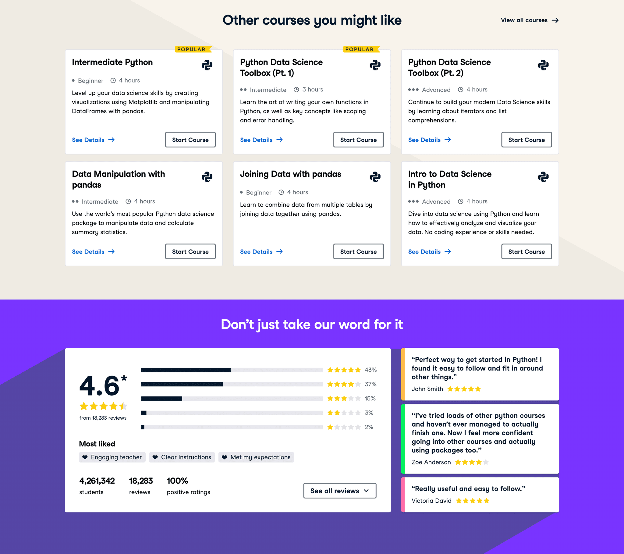
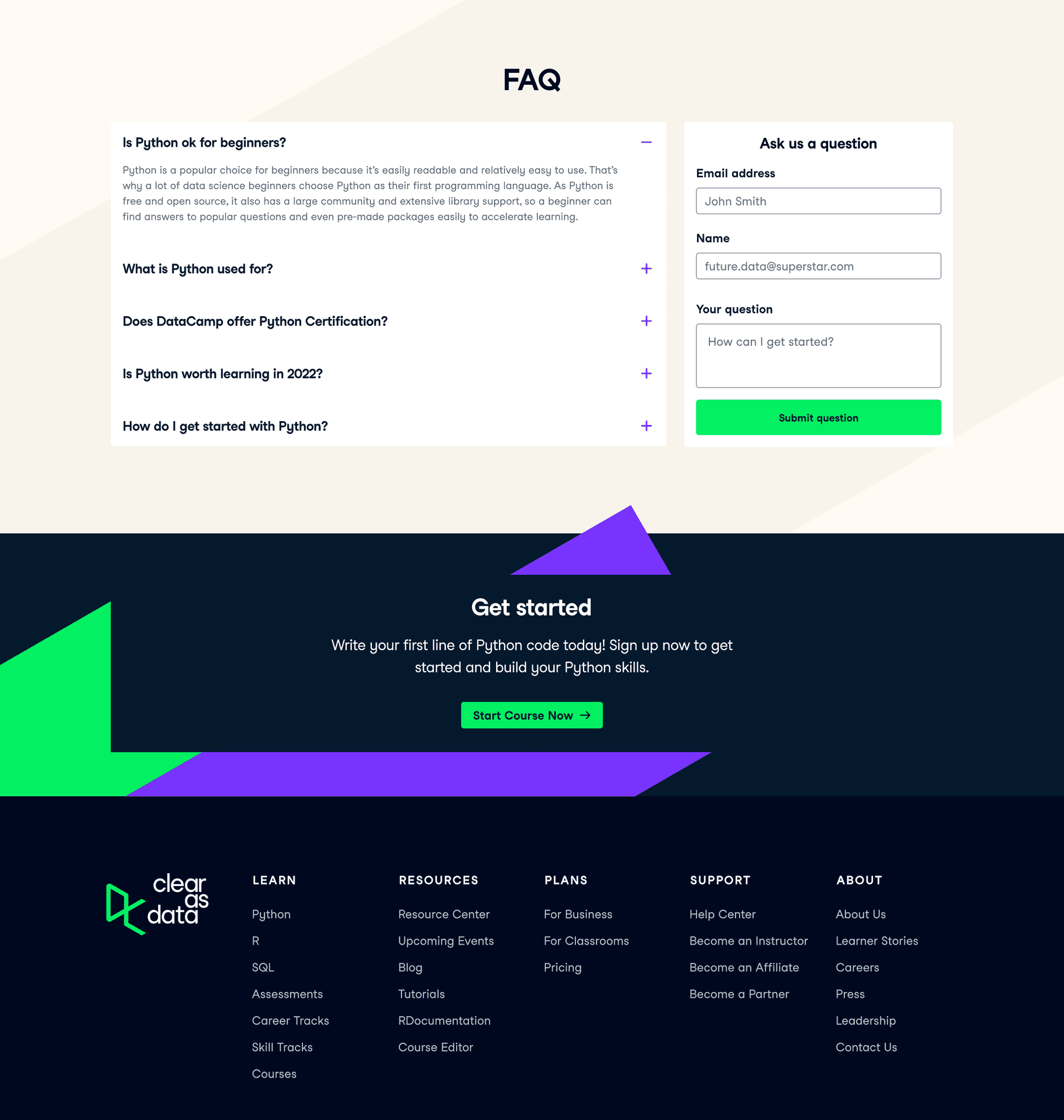
Finally, in the last bit of the page we put in an FAQ section, as well as a "Get Started" section before the footer to catch the user before they leave.
Measuring results
We made sure to A/B test on pages with high traffic so we can get statistical significance quicker and minimise the time testing. This is currently in the works so we are unable to quantify all the results, but here are some results for the implementation of FAQ and Reviews sections.
Adding FAQs saw an increase of
+10.5%
in organic traffic
Adding Reviews saw an increase of
+4.7%
in organic traffic
Additionally, these tests (which included adjustments to copy to aid SEO) led to our courses being featured on the first page of Google.
design system
Design unification
The DataCamp Design System, Waffles, has supported 6 company products for about 3 years now. Its main goal is to ensure consistent, unified communication with customers across all products.
Over time working at DataCamp I noticed a lack of unity across the product and found the best way to aid in helping this was to take on a design system role. I honed my focus, becoming the sole designer within the Design System team, all while collaborating with the broader design team on UX/UI projects. Acted as lead designer in DataCamp's internal design system, design tooling and infrastructure initiatives. Here's a glimpse into my key responsibilities.
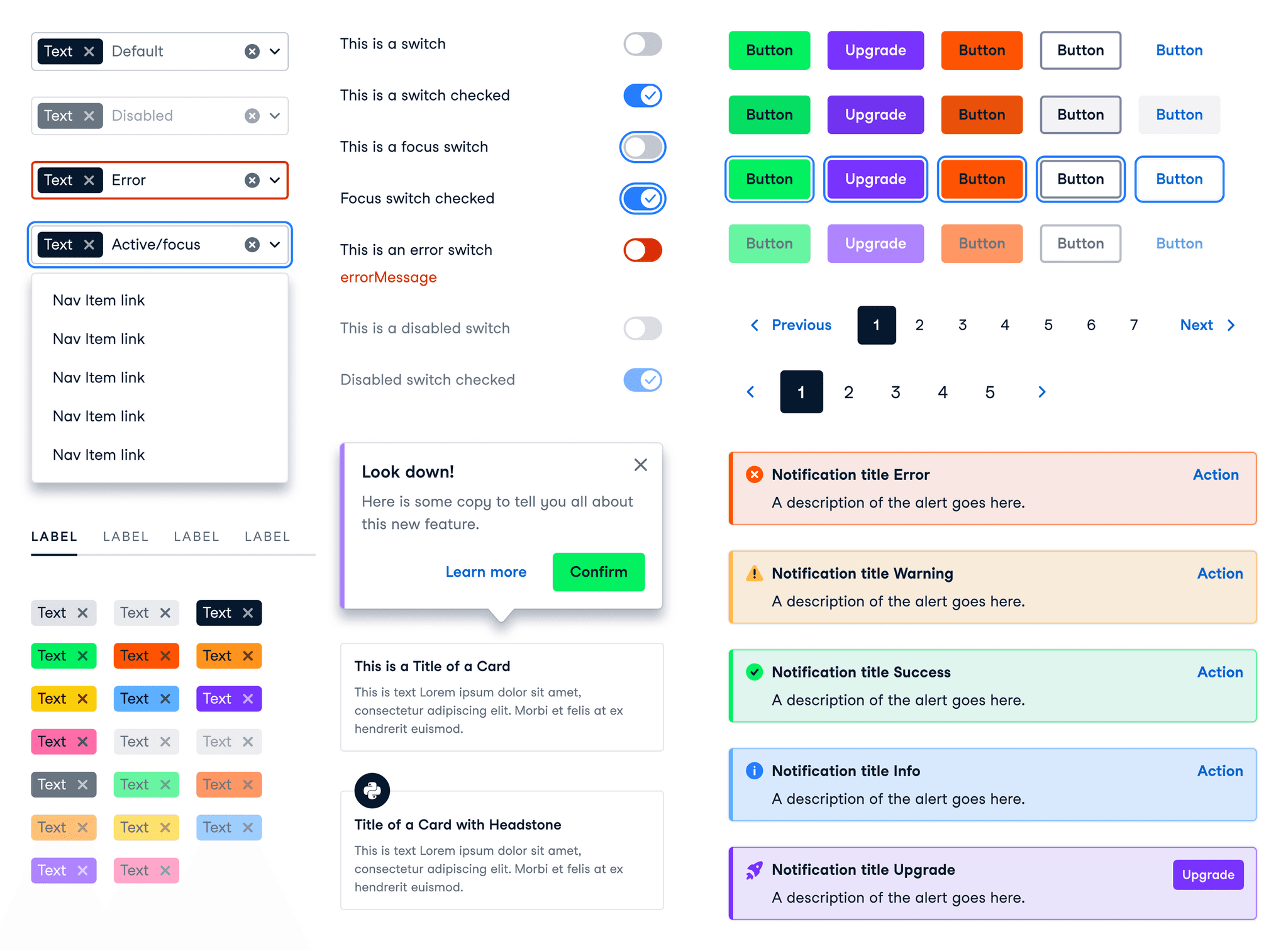
responsibilities
Component Creation: components keep the site consistent & ensure design scalability. It was very important we had a set of components the designers were happy with using that fit industry standards. Through research, ideation, iterative design and design reviews, I gave new life to our once fragmented library of components.
Accessibility-Driven Design: Committing to adhering to accessibility guidelines meant further unification, crafted to be inclusive and accessible. This was especially important if we were to improve the navigability of the site, and for all users.
Overlooking design put out into production: It was important for me to be the spokesperson for consistency, as well as teaming up with the Design System engineer to document each component and its behaviour on our Design System website.
Creating components
At the beginning of each quarter, I collaborate with product designers to identify gaps in the design system and the need for new components. These conversations help pinpoint areas for enhancement, improving the overall user experience and helping make our design language more consistent.
Once feedback and requirements are gathered, I conduct research, including competitor analysis, to collect UI requirements and create a brief. Following the atomic design methodology, I begin by defining atoms, ensuring I maintain a global style covering colour usage, typography, breakpoints, grids and spacing. I then merge these atoms to make small, reusable molecules, that form components. This approach allows for easy updates across design files, maintaining consistency in views for mobile, tablet, and desktop.
Moving forward, I design UI component layouts based on initial sketches, continuously testing them in a product context. Feedback sessions with designers follow, ensuring alignment with their needs. Depending on the feedback, I iterate further or proceed to hand over the designs to engineers for development.
but that's not all
Final thoughts
Although this was a start, I acknowledge there is still much to do. For example the side navigation in the logged-in section of the site was historically made piece by piece, and at the time of designing did not consider future needs. This means this is currently quite confusing and does not lend itself well to exploration.
However, the updates outlined in this project have improved the navigation structure massively and made navigating the site much more pleasant than it was previously. We have improved the explorability of the website, enabling the user to find what they want with more ease than before, as well as keep them moving around the site, even after they have found what they need. Not to mention the whole website now benefits from a much more aligned design system.
View next project