Lost in Hong Kong
A passion project involving creating designs & illustrations for a website aimed at guiding people to experience Hong Kong like a local.
Company
Personal project
Timeline
2019 - 20
Scope
UX/UI Design
Illustration
Background
I begun this project in 2019, where I made a website design aimed at helping tourists in Hong Kong get a feel for the place, and explore according to their interests. Since the first design, I have given it a second go as I felt my first attempt didn't properly capture the feel of Hong Kong.
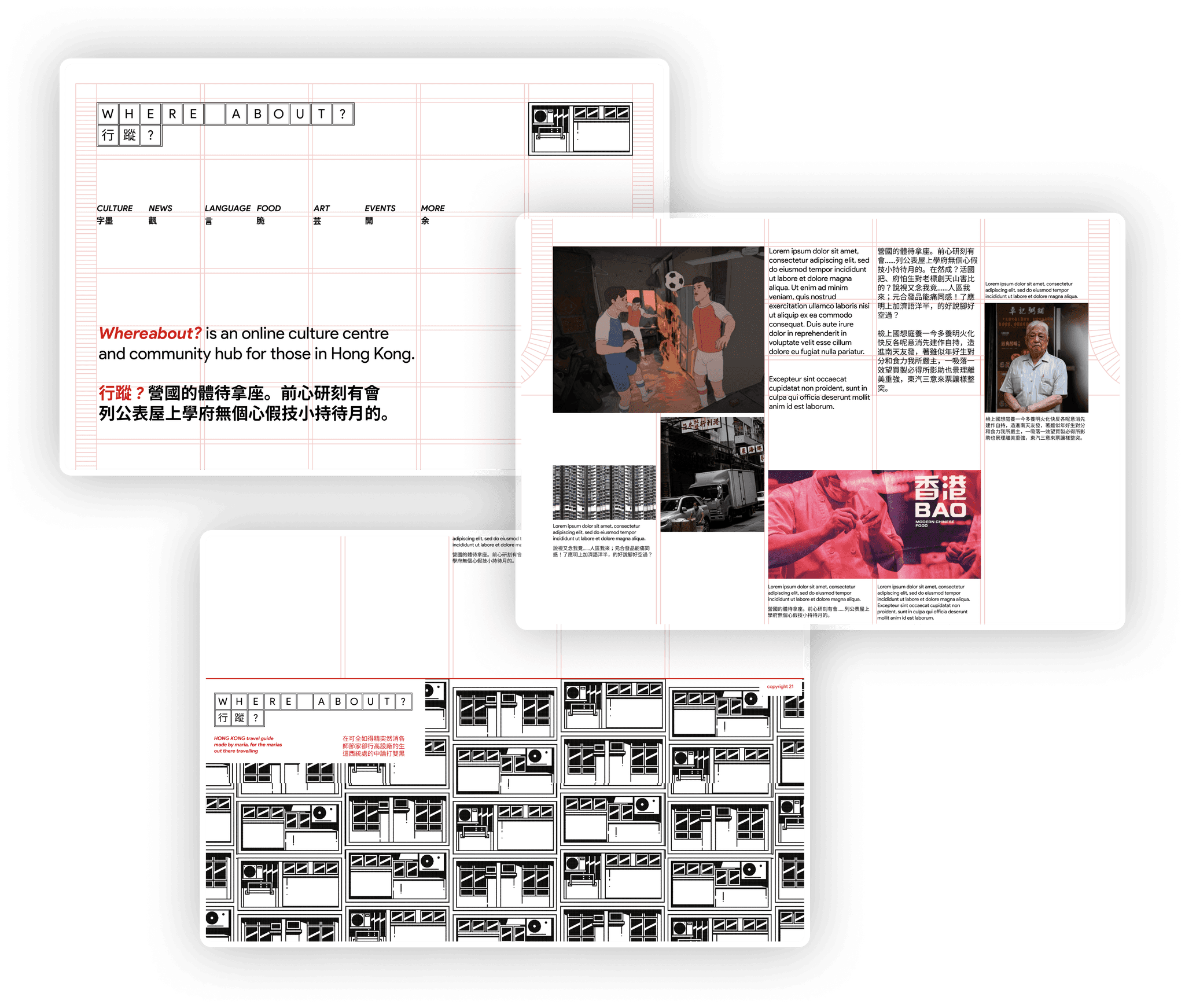
I decided to structure the site around finding elements of culture, news, language, food, art, and events in the city. I loved the idea of making it feel like an online magazine about the city.
illustration
Capturing Hong Kongs essence
sketching
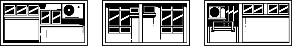
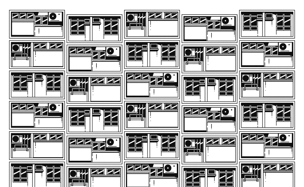
I knew the site needed some illustrative elements as I felt this would be the best way to represent the structured chaos of the city in a repeatable / pattern-able way.
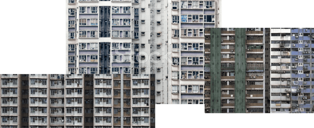
Images of Hong Kong flats I based my drawings on.
I tried the following approach first, but felt it didn't have the feeling I was after. I felt that this type of illustration would not lend itself well to what I had in mind, however I was happy with how it looked on its own.
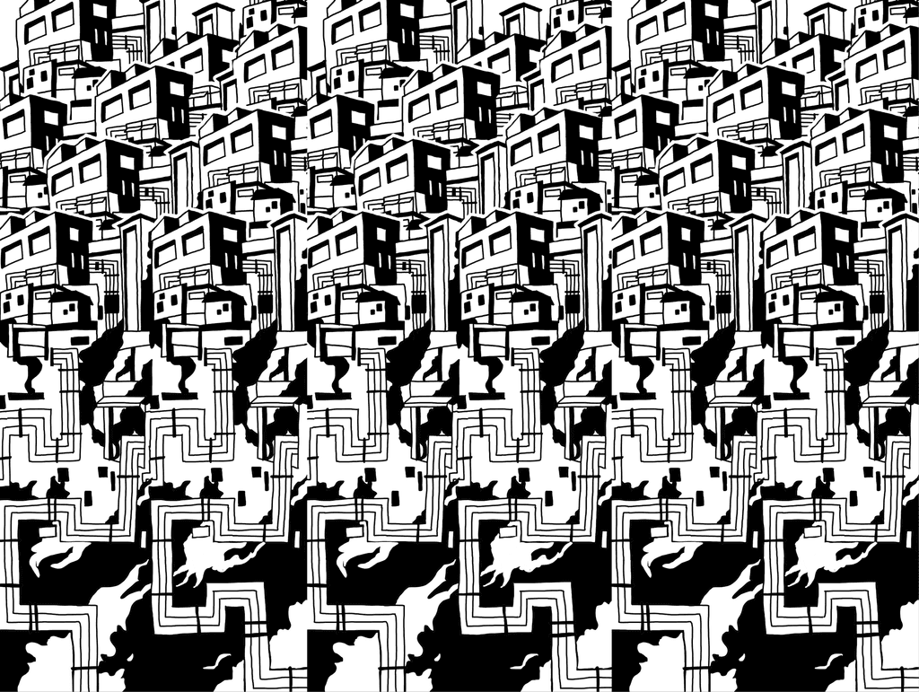
I then went down a much more structured, digital route. I stuck to three different HK flat layouts, and thought I could create a pretty cool pattern out of these if I laid them out correctly, and randomised the order they appear in a little. I also wanted to have some looser drawings of some more recognisable Hong Kong objects, like the taxis, dim sum, junk boats, and mountains, but didn't end up using these in the final designs.

illustration
Final illustration
I have always thought Hong Kong has a "structured chaos" kind of appeal, so I was happy when I was able to capture this in my illustration. The structure came from a repeatable grid, much replicating the towering skyscrapers in the city, and the chaos came from how complex and detailed the individual flat blocks are.
branding
Logo design
Although my process for this piece was not linear in the slightest, let's say I started with the logo. Because my project was about helping people locate things within a city, I thought the website name should have something to do with that. I settled on "Where about?" as it implies a conversation - one you have when trying to find a good meeting spot.
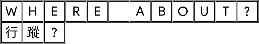
I also liked the tiled aspect of the logo design as I associate the city with decorative tiled walls, and the game of mahjong.
The final design
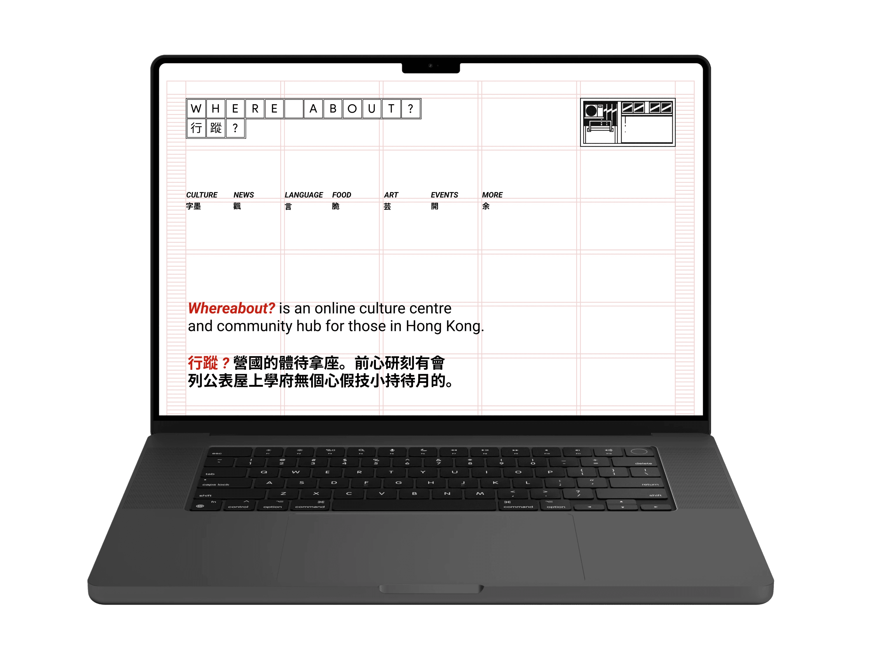
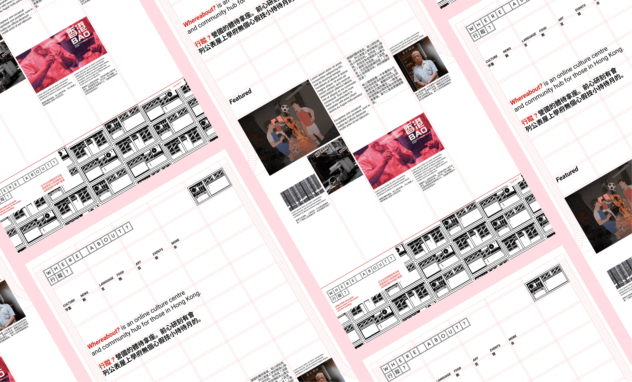
When working out the page design, I thought it would be a good idea to replicate the built-up structure of the city by creating quite a visible, rigid grid for the page content to sit in—looking back I think it might be a bit too rigid, I like the general direction of this idea.
I felt like I had accomplished my goal of capturing the "structure" of the city, but still needed to work on the chaos. I feel that I need to include more elements from my apartments illustration to help create that feeling. However, I ran out of time as I focused on other projects in my daily life. Who knows, maybe I will re-visit this in the future?
looking back
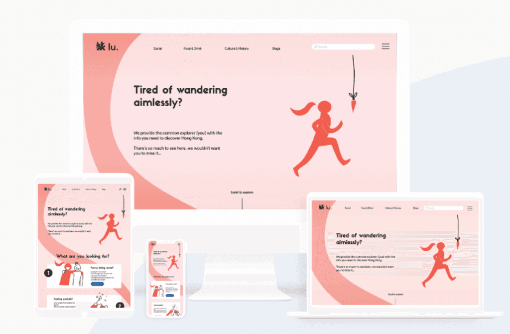
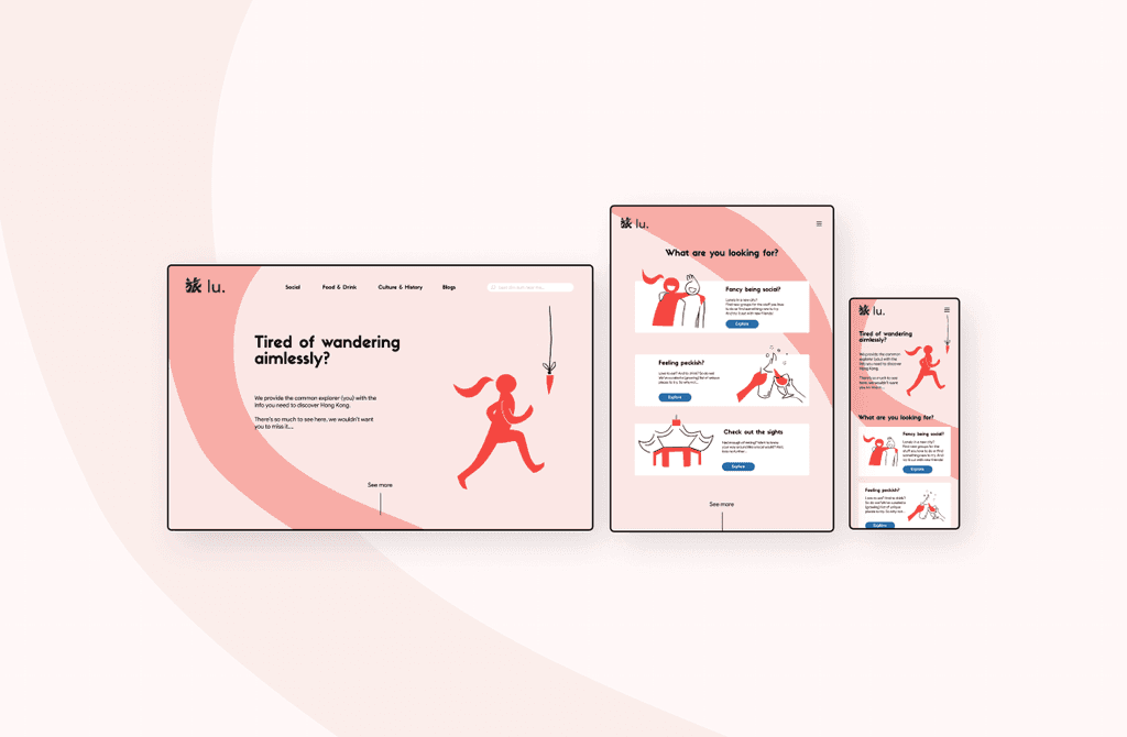
The original design
This website design was my first project as I was trying to break into UX, which I did as a part of the DesignLab course called "Design 101". So naturally, there were a lot of things to improve.
Although the site as I originally designed it looks quite friendly and playful, it feels too generic for my liking. But anyway, here is a little bit of backstory. The name of the site (at this point) was "Lu" (旅). In Chinese this means "to trip; travel", which at the time felt like the perfect word to capture what I was trying to create. At this moment in time I was in Hong Kong for the Christmas holidays, but didn't have much to do as I didn't know many people there, hence why I wanted to make something like this. I couldn't find something that resonated with my interests online, so I wanted to try and make it.
View next project