Certification
Improving DataCamps Certification product
I spent time as the Certification team designer to improve the styling, functionality, and increase visibility of the product.
Rethinking the journey from discovery to Certified
We had generally quite low registration rates for our Certifications. People weren't aware that we had them, weren't signing up to DataCamp for them, and if they did find our product, weren't registering. We found a lot of gaps in the experience from discovering our product, to taking the Certification, so we redesigned it.
Logged off visibility
Designing pages for each certification, and redesigning our existing homepage to improve conversion.
Improving onboarding
Improving our onboarding flow to increase activation by directing users to certification.
Revamping registering
Redesigning the logged in certification pages to better explain our value and improve conversion.
Logged-off visibility
step 1
Introducing pages for each of our Certifications
We did not have a full set of dedicated Certification pages on our logged-out website, which hurt discoverability. Based on our personas, user feedback, and competitor research, I created a structure for how I wanted the pages to flow.
I kept the following in mind while designing:
Understand at a glance - Ensure key pieces of information are front and centre above the fold, so that the user doesn't have to search unnecessarily hard for basic information about the page that should be immediately clear
Breakdown of process - Help the user understand what exactly it consists of, and whether or not it will help them in a clear and concise way
Social proof - Make sure it is clear that others have taken our Certifications before and that they had a positive experience. People tend to follow the behaviour of the majority, and so it is important to surface thoughts & opinions of people who have enjoyed our product
Smooth navigation onwards - Ensure the user can keep exploring if they didn't find what they were initially looking for
Additional benefits - Highlight any additional benefits to our product that make us unique. We have a Certified Community of members which we previously didn't make a big deal of, so I wanted to create a space to highlight this.
step 2
Designing & aligning
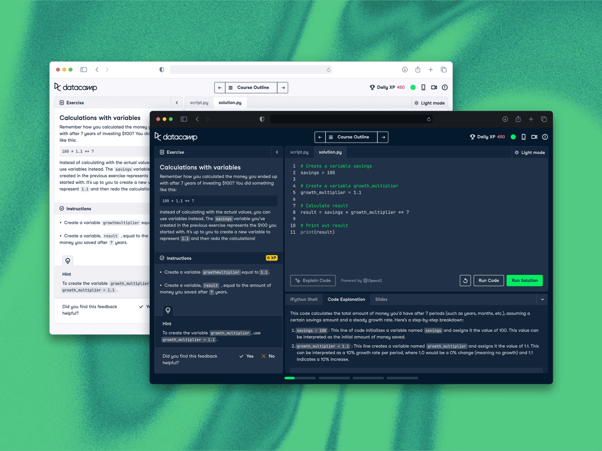
I created many sets of wireframes to explore my ideas, and after we reached an agreement on an approach I started working on the final UI in Figma. Sticking strictly to our design system, I created a set of pages we were happy with. I then collaborated with the copy and content teams to create engaging text for the pages. This was tricky as I had not previously had experience with organising copy creation, and was largely due to the fact we didn't yet have a product manager on the team to help with this, however I was able to learn from the process.
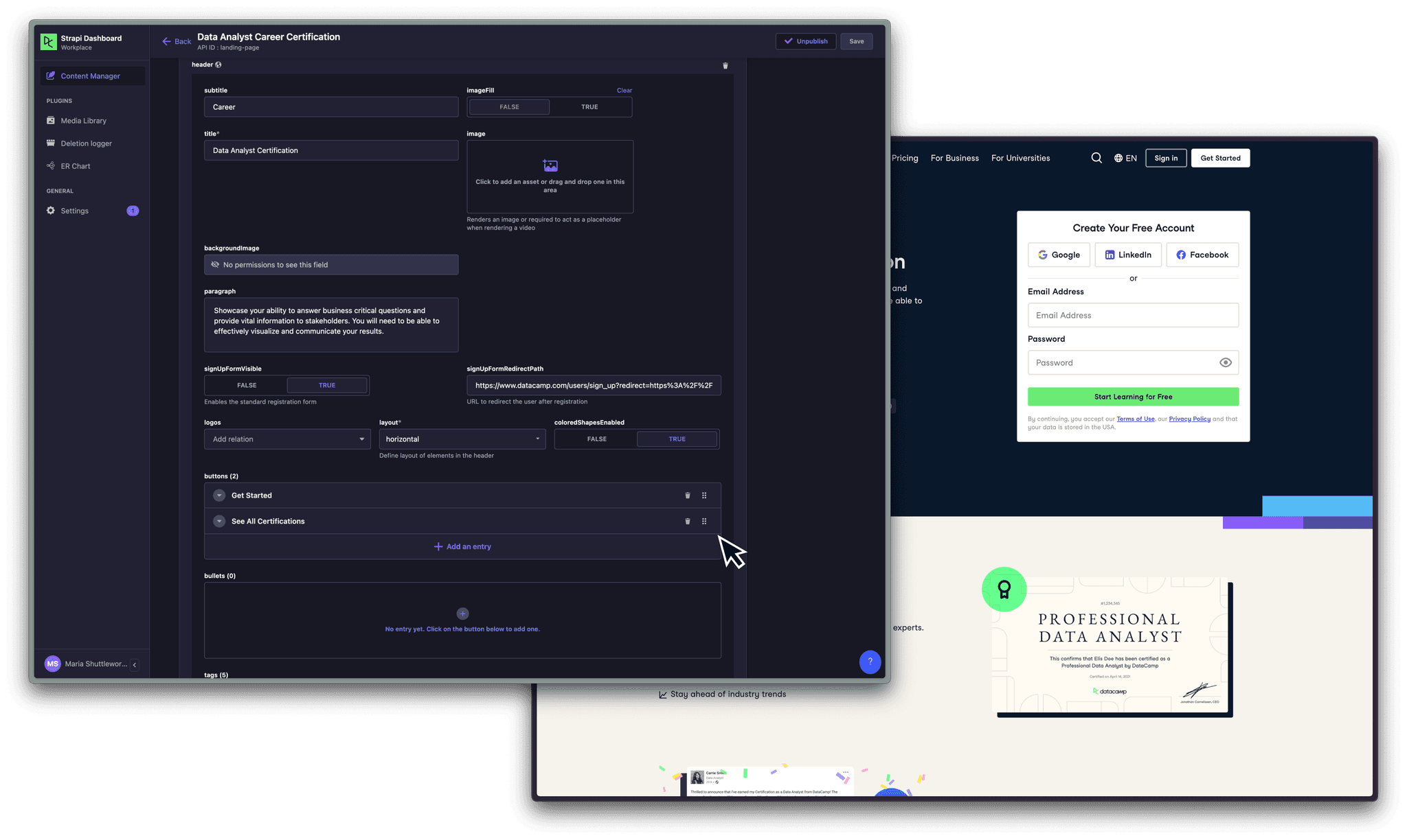
A limitation of the project was that I had to work with our CMS, Strapi, which restricted our options for modernising the UI as I had to work within the Strapi catalog. However it was a good learning experience — both from a technical point of view, as I now have solid knowledge of how to work in Strapi, but also from a creative perspective, as it can sometimes unleash your creativity working within constraints.
The final step before publishing was to organise page localisation. DataCamp have recently introduced Spanish translations for all our pages, so this needed to be considered before publishing. I sent through the necessary requests, and edited the images that have text in to reflect the correct Spanish translations.
step 3
The final designs
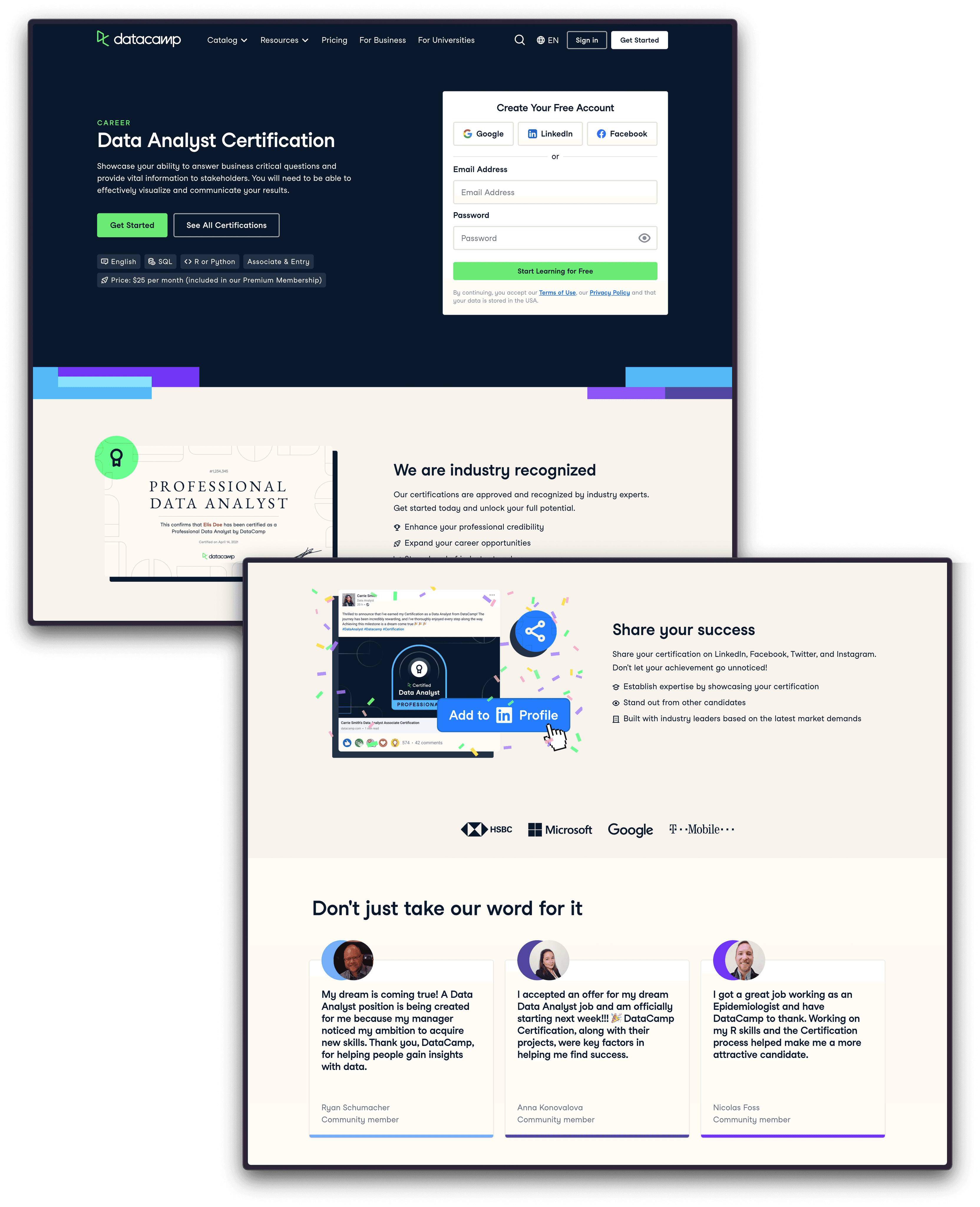
Easy registration & Social proof
To reduce bounce rates and improve page clarity, I made sure to keep key pieces of information above the fold, e.g. Certification description, duration, technology types and price.
We also wanted to increase conversion from these pages, so we placed a registration form above the fold to make it as easy as possible for a user to sign up.
To reassure users that they are in the right place, and that other people have taken our Certifications before and benefitted from them. I spoke to users in our Certification community and created testimonials out of some success stories.
explaining the process
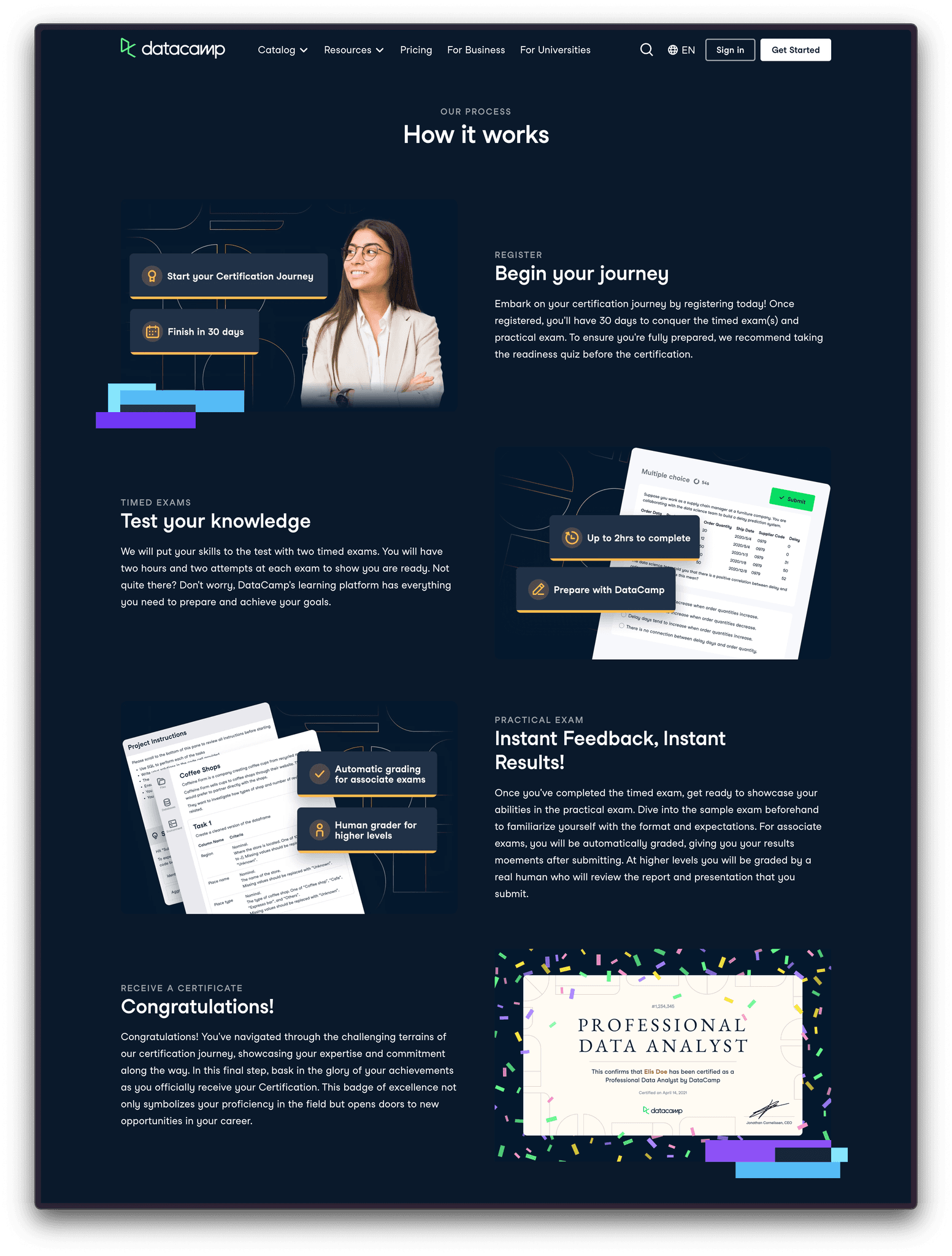
Something we were lacking - that every competitor of ours had - was a process breakdown section. It was clear to us that this needed to be introduced, as this is vital in helping a user decide if the process we are offering could work for them. I set about organising which sections we were lacking, breaking down our process into digestible sections, requesting copy, and creating the images myself.
step 4
Measuring success
We started 2023 at
19.5k
logged out clicks
We ended the quarter at
73k
—two months after the new pages released
Since releasing these new pages, our logged-out clicks have increased by 274.36%, which is a significant improvement and shows that there was definitely a demand for these pages. We will keep an eye on these metrics going forward as I would be curious to find out if this improvement is a result of us simply introducing pages which didn't exist before, or if it is because of a genuine improvement in structure that users are finding useful.
Updating the homepage
I re-designed our homepage so that it accurately represented our offering, as well as modernised the styling according to our design system. Similarly to the individual Certification pages, I was responsible for researching best practice for page structure, organising copy and image creation, localisation, and publishing in Strapi.
Content coming soon! 😇
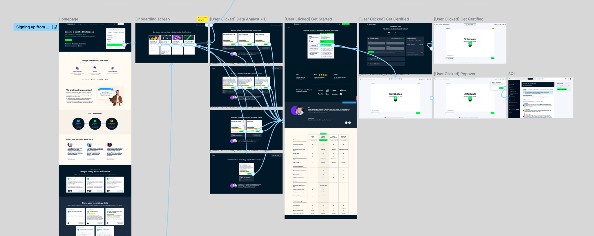
Improve onboarding
step 1
Directing users to relevant Certifications straight away
Our onboarding process was the same, no matter which of DataCamp's products you were signing up to use. This meant that even if you were signing up from a Certification page because you were interested in getting certified, your onboarding process wouldn't allow you to sign up for one, instead only focusing on learning materials and signing you up for a course.
This meant that our activation rates were low. We would see good conversion from our logged-off pages, but we were losing users as once they had made their account they would be directed into a different part of the product.
step 2
Creating a proposal
I worked with the head of product to create an improved flow for our onboarding. The goal of the redesign was to route the user to the most relevant Certification, enrol them in the preparatory content and land them in the first preparatory course so they can start right away. The hypothesis was that landing users in a course will increase activation by showcasing better what DataCamp offers.
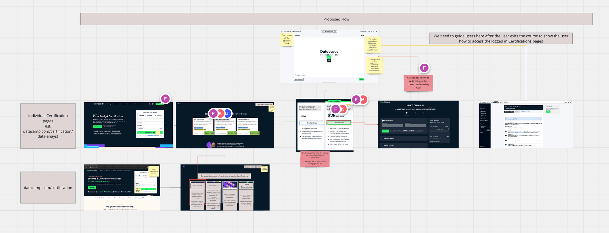
Once we had ironed out the kinks and communicated with all the stakeholders, I created hi-fi designs and prototypes to test the idea internally before releasing.
We also wanted to give users the option to pay for Certification straight away, so we added a button which takes them immediately to the checkout page (skipping the course enrolment). This was so we can capture more direct subscriptions for highly engaged users who are ready to take the Certification exam already.
step 3
Measuring success
We are still in the process of measuring improvements in conversion and registration.
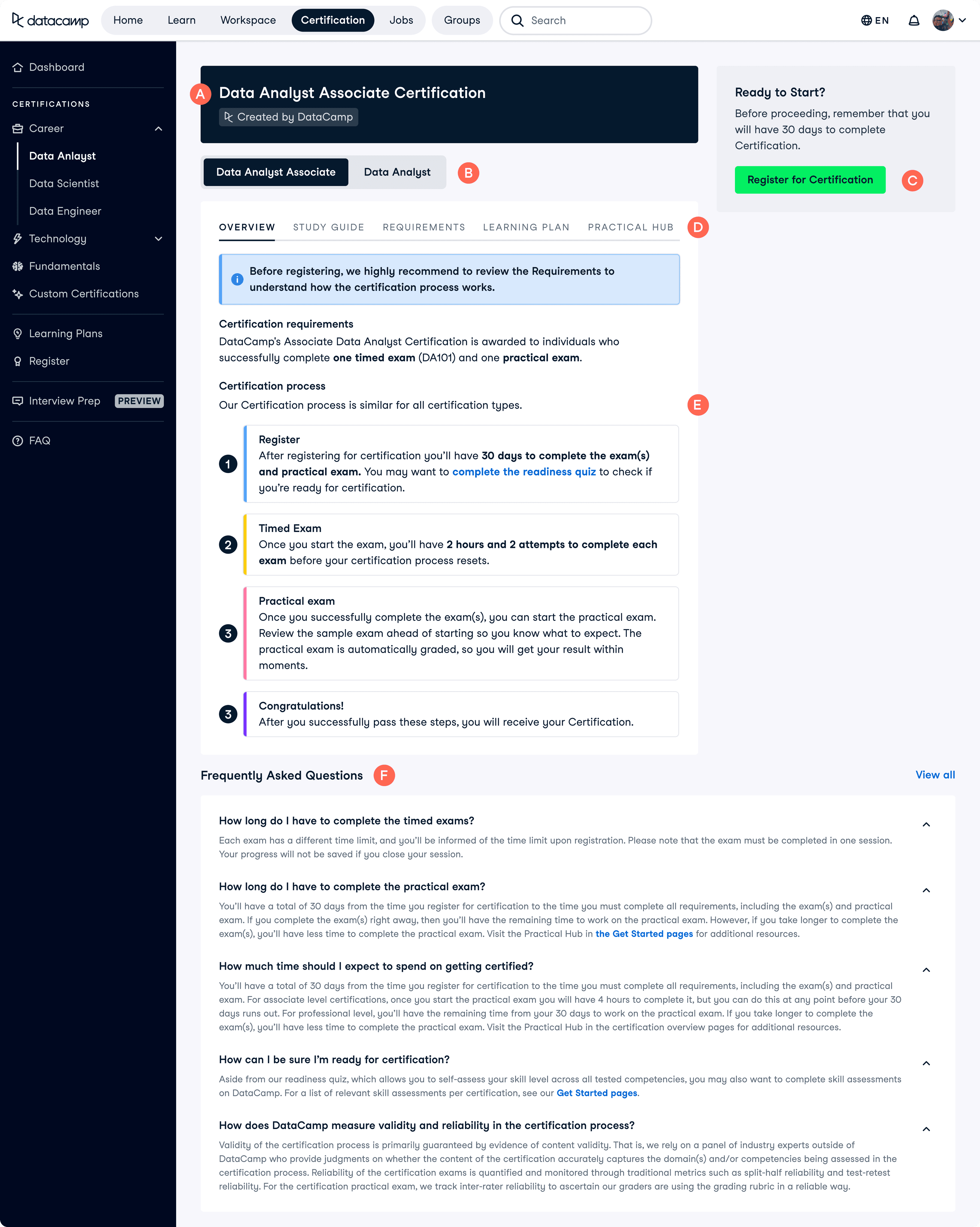
Revamping registration
step 1
Understanding the problem
Our logged-in Certification description pages were underperforming, with a conversion rate of only 8.6%. These pages serve as a critical touchpoint between the user and our Certifications, where we articulate the value and purpose of our offerings and attempt to persuade users to enrol. Despite these pages receiving significant traffic, over 50% of our total registrations originate from them. This indicates that while these pages garner plenty of views, they fail to effectively convey our value proposition, resulting in lower-than-expected sign-up rates.
Current page breakdown
I started by critiquing our current page so I could pinpoint areas to improve.
What is this page?
We do not explain what this Certification is, or what it will help you achieve. We are missing the opportunity to show what value we can provide the user here
Levelling
Some of our Certifications have two difficulty levels to them. This is not clearly explained or demonstrated anywhere else on the page other than here
Registering
We are not giving the user many meaningful reasons to take this Certification. We state what exams they should pass but not what they could gain, how it could help their job search, or showing success stories
Tabs
Because this is so hidden (and also contains a lot of dense text paragraphs), the user will have to have high motivation to read it all
These tabs hide a lot of very relevant information, such as what a user will need to do to prepare for this Certification, and what it will test.
What the process?
The section on our process acts as a brief overview instead of explaining each section in depth. The user will leave the page knowing how many exams to expect but not what will be tested, which is key information when deciding
This section feels overwhelming. There is a lot of tightly packed, uninviting text, as well as colour creating visual noise.
FAQs
A lot of important information about our process and requirements are hidden in the FAQs, which should be integrated into the section above as not many people will read it here
TL;DR - I hypothesised that these pages weren't performing well as we weren't explaining our value well, and these pages don't clearly outline what is required to earn a Certification. Valuable information about certain parts of the process are hidden behind tabs, and the pages are overall very text heavy, repeating themselves and putting off users from reading the content unless they are generally very motivated.
step 2
Research and workshopping
I did some desk research as I wanted to find out how our competitors created similar pages. I asked my teammates to join me in doing competitor research so that we could have a collaborative workshop where we could share our findings. We then organised these into themes, all of which were very helpful for me in later prioritising features.
We found out the following:
Page structures across different course / certification pages stayed mostly the same. They all started with an overview of the page contents, moving on into some bitesize key takeaways, the knowledge / skills you'll gain, their process, and lastly, why to choose their offering.
Their information architecture was comparatively very clear and logical.
They visualised their content very well
They gave motivating reasons as to why the user should take their Certifications, as opposed to another one.
step 3
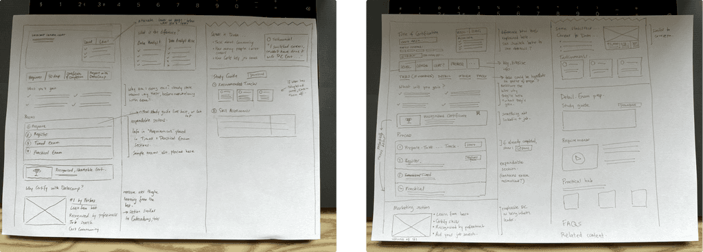
Sketching
I expected there to be a lot of back and forth, and iteration in this project so I made sure to start the design process with rough sketches instead of diving straight into more polish UI. This was to save time as I could iterate more and quicker this way.
I was lucky enough to have my stakeholders really love this direction on the first go. But it wouldn’t have been a problem if they have asked for changes since everything was so low-fi at this point and could be changed easily. The next step was for me to create a more polished version of the UI.
step 4
Creating the UI
Now that I had got agreement on the general structure of the pages, I now needed to refine the sketches and create something more robust.
The tricky bit was getting the information hierarchy correct, as you'd ideally want the user to realise that there are two levels to the Certification before giving up after thinking that the version they're currently viewing is too easy for them.
I went through a few rounds of designs on this area, sharing it with the wider design team for their input, as well as looking through Mobbin to see if other websites had solved this problem. We eventually landed on a solution we were happy with. We agreed that the most intuitive place to put it would be just underneath the Certification description (option C), as only after you'd read this would you wonder about difficulty levels.
Another important aspect of designing these pages was considering the stage in the Certification process the user would be in when viewing the page. The content would need to change depending on whether they were viewing it for the first time, or had already registered for the Certification.
There were a couple of areas in the design I was finding challenging. The biggest area was deciding on the most intuitive way to switch between Certification levels (some of our Certifications had two levels of difficulty, and a restraint on the project was that these two levels had to live in the same page, with the ability to toggle between the two).
If the user has net yet registered…
The page would focus on several things:
Explaining our value so that we appear as having the best Certification available
Clearly outlining our Certification process so that users understand if they are ready
Explaining the difference between levels and making it easy to understand which one is best for you
Making the pages clear and easy to process so that users aren’t overwhelmed
Overview
Explain what the user is seeing on this page: include a title, information about what will be covered, level clarification, an easy way to sign up, backed up my social proof.
Key takeaways
Condense the key info on the page into bitesize pieces of information that are easy-to-process. This way the user will be able to quickly understand if this certification is for them, as well as quickly understand how much of a commitment taking this certification would be.
What will the user gain
Remind the user why they're here and reassure them they're in the right place. By highlighting what they'll get from this certification, e.g. Industry recognised Certificate, improved changes of finding new job, test your knowledge... user motivation is likely to increase, as they'll understand why this might be worth their time and energy.
Process
Clear way of showing the process. Not overwhelming as the user can show / hide sections at will. Allows us to put in more information on the prep materials - which we dont do well currently.
Visualise the Certification the user will get at the end of the process, showing that they will get something tangible from their effort.
Why DataCamp?
Reassure the user that they will be learning from the best & that this is a professional, recognised Certification.
Level comparison
Allow the user to see in a clear, laid out format the differences between the two levels - important when making a decision. The previous way we allowed the user to compare between the two was simply flicking between the two pages, which is very bad UX.
If the user has already registered…
If the user has already registered, the focus would shift to focus on the stage of the process the user is in.
If the users next step would be to take the Timed Exam, the page would focus on this, emphasising the information necessary to prepare for and pass the exam. They would no longer be able to see all the more general, marketing-like information that was in the previous page.
Similarly, if their next step would be to take the Practical Exam, the page would have this step front and centre.
When the user passes their Certification, the page would display their achievement loud and proud, with clear links to download and share their certificate.
step 5
Reflection
Even though the project isn’t done yet, the only thing I would change is I wish there was time for a couple of user interviews. I was able to work with competitor examples, and team feedback, but it would have been really interesting to see what the users would have said about the Certification pages.
View next project